


Tools
Selecting a tool makes it active. The active tool is highlighted with a filled background. The leftmost cluster is navigation (Interact, Pan). The rest are content and markup tools. Tools are mutually exclusive, which means selecting one deactivates the others.Interact
Interact is the default tool. Use it to select frames, drag them around, and click into a live Artifact to use it as a real running app. With Interact active, clicking a frame selects it and surfaces the per-frame action bar.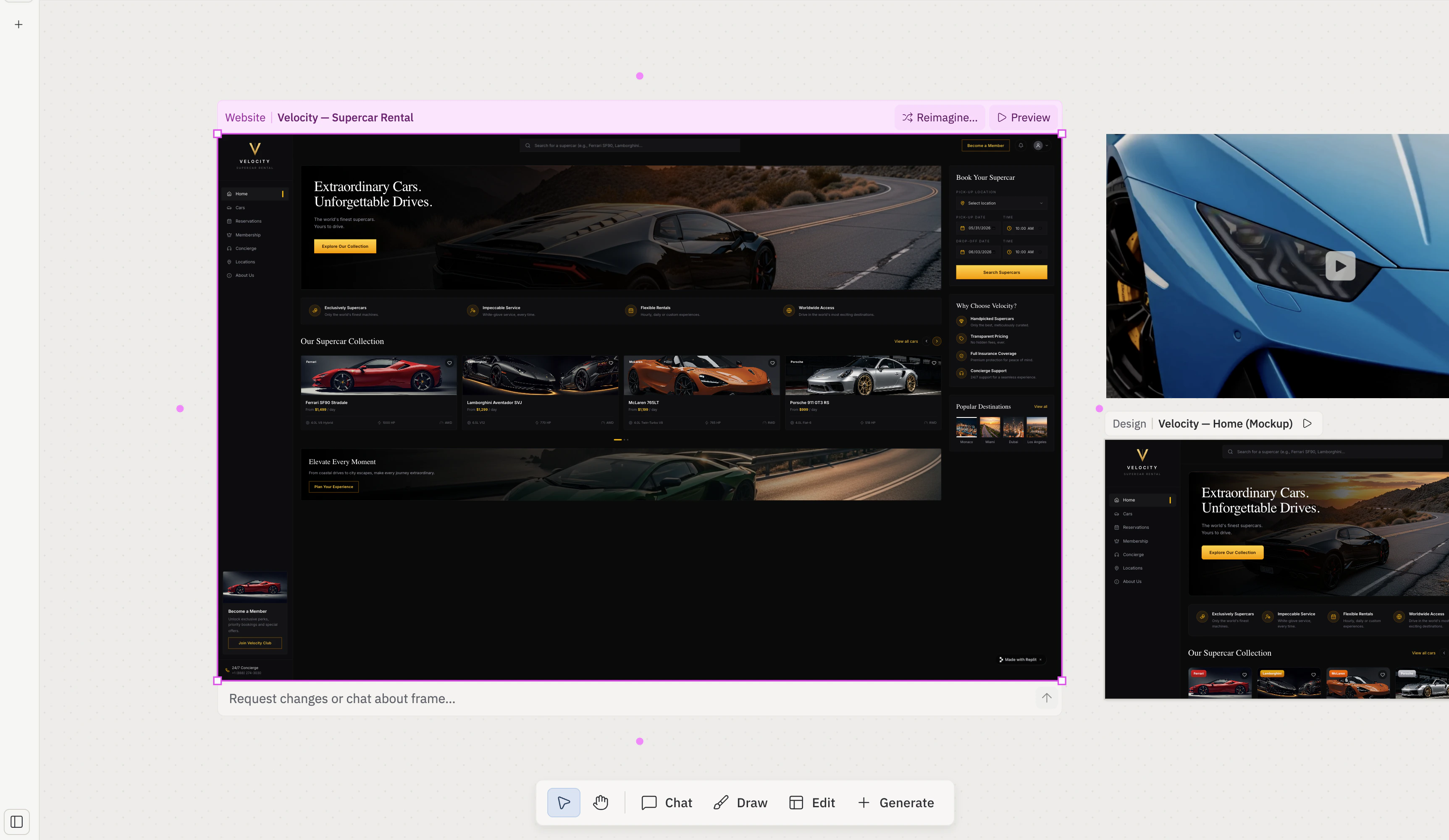
V. Gate: always on.
Pan
Pan switches the cursor to a grab tool so you can drag the board itself. While Pan is active, click-and-drag moves the viewport instead of selecting a frame. You can also pan from any other tool by holding the spacebar and dragging, or by middle-click-dragging.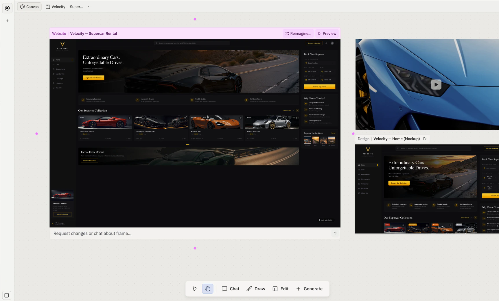
H. Gate: always on.
Chat
Chat drops a small chat composer directly onto the board so you can prompt Agent without leaving Canvas. Selected elements and frames are still attached to the message as snapshots, the same as when you send from the side Agent chat panel.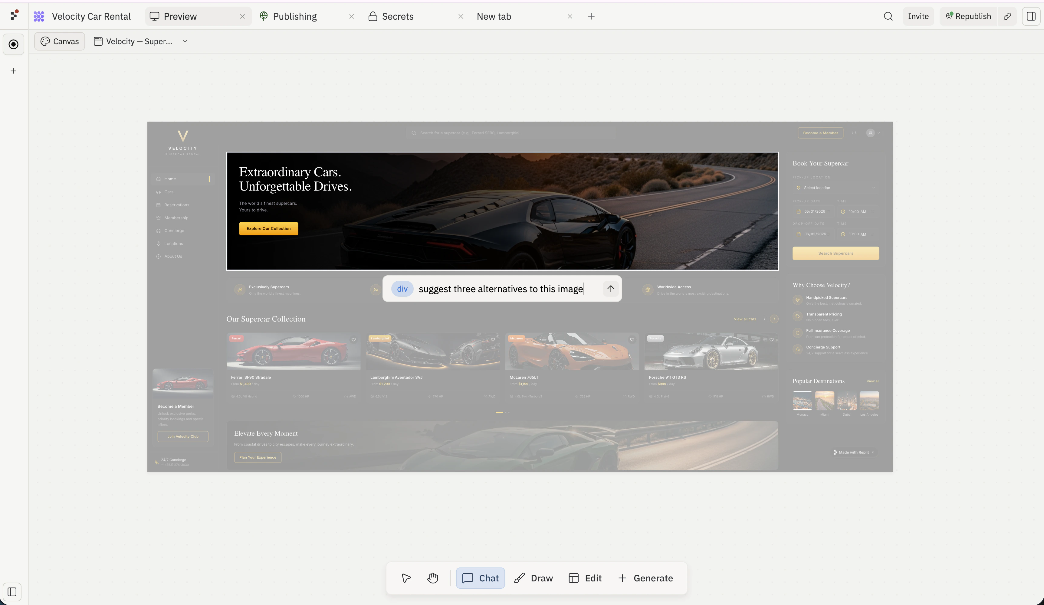
Draw
Draw activates the markup tools such as freehand draw, arrows, sticky notes, and shapes, so you can sketch on top of frames or annotate the board. Use it to circle problem areas, point to elements you want changed, or leave a written note next to a frame. When Draw is active, a Shape properties bar surfaces above the floating toolbar with color, stroke, and fill controls for the current markup tool. It hides automatically when you switch back to Interact or Pan.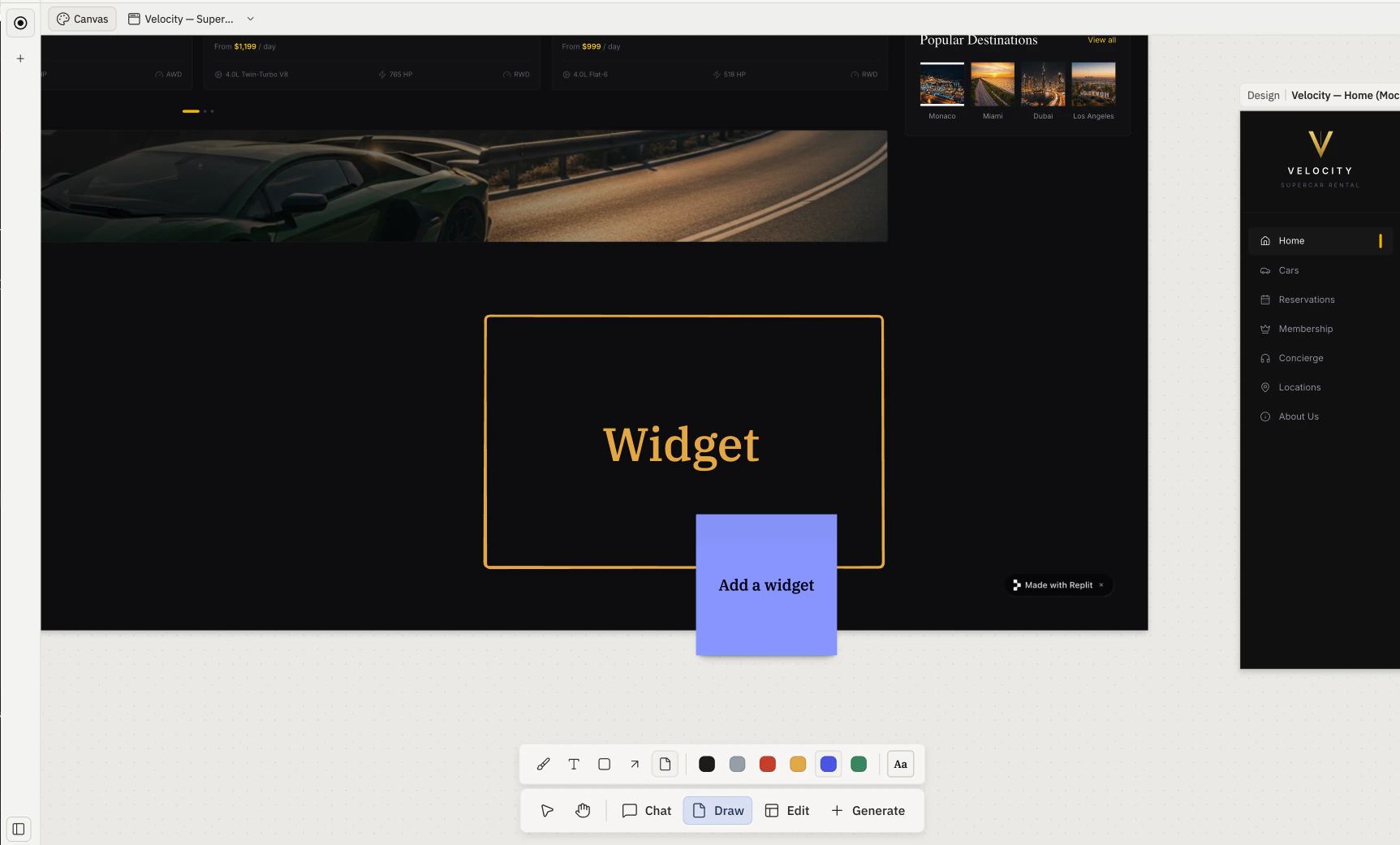
Edit
Edit is the visual selector for elements. With Edit active, click inside a live Artifact to target an element (a button, a heading, an image). Selecting an element opens the Visual Editor — a right-side panel of controls (Layout, Color, Border, and more) paired with an inline prompt for asking Agent to change just that piece. See Elements and Visual Editor for the full flow.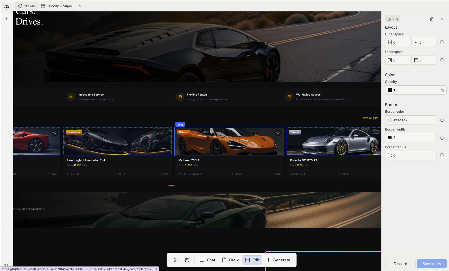
Generate
Generate opens the Generate media popover for images, videos, and vector graphics. Pick a kind, write a prompt, and Agent places the result as a new frame on the board.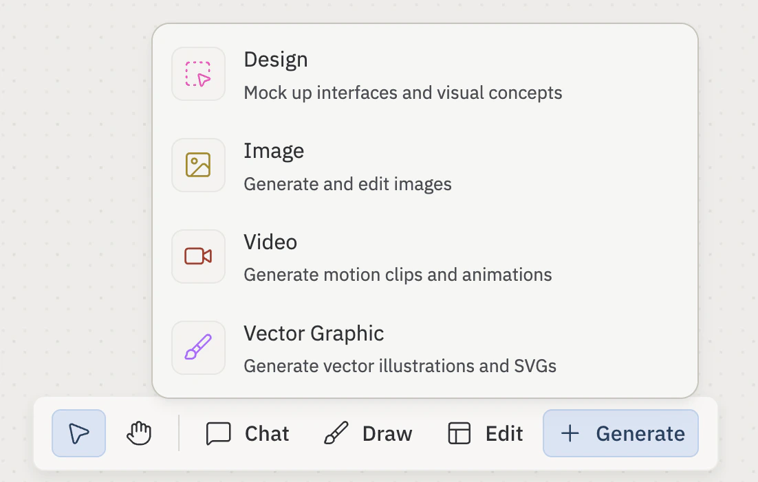
- Design — Image
- Video
- Vector Graphic
- Model: the generation model to use. Available models vary by kind (see the table below).
- Prompt: plain-language description of what you want Agent to generate.
- Generate: submits the request and reserves a placeholder frame at the cursor position. The placeholder transitions to a live frame once the asset is ready; if generation fails, the placeholder is removed and an error appears in the chat panel.
| Kind | Best for | Current models | Kind-specific controls |
|---|---|---|---|
| Image | Raster output (PNG / JPG); moodboard imagery, hero shots, reference art | Nano Banana, Nano Banana 2, Nano Banana Pro, ChatGPT Images 2.0 | Aspect ratio (1:1, 16:9, 9:16, 4:3, 3:4) · Size (1K, 2K, 4K) |
| Video | Short motion clips and animations | Veo 3.1, Seedance 2.0 | Aspect ratio · Resolution (e.g. 720p) · Duration (e.g. 4s) · Audio toggle |
| Graphic | SVG vector output; icons, logos, diagrams, stylized illustrations | Claude 4.6 Opus, Gemini 3.1 Pro Preview | Animated toggle |
The model lineup changes frequently. The table reflects what’s currently available; check the in-product dropdown for what your account can use today.
Attach visual references
Before you generate, you can attach things already on your board as visual references. Agent uses these references to guide the result so it matches the look of your project. Open the + menu inside the Generate media form, then choose an option:- Upload file: upload an image from your computer to use as a reference.
- Select canvas elements: pick existing items from the board. Frames are captured as screenshots; text and note shapes are attached as text summaries.
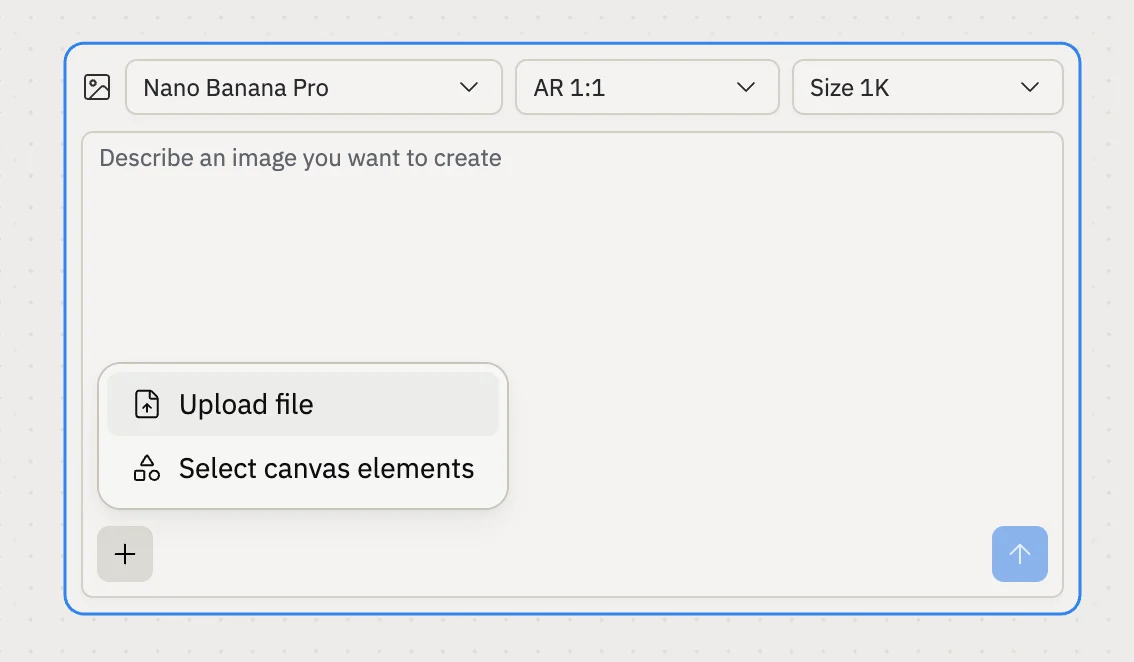
ChatGPT Images 2.0 does not support uploads at the moment. Switch the model, for example to Nano Banana Pro, to attach visual references.
Keyboard shortcuts
| Shortcut | Action |
|---|---|
V | Activate the Interact tool |
H | Activate the Pan tool |
Hold Space + drag | Pan from any tool |
Cmd / Ctrl + scroll | Zoom |
Cmd / Ctrl + + | Zoom in |
Cmd / Ctrl + - | Zoom out |
Cmd / Ctrl + 0 | Reset zoom |
Shift + click | Add a frame to the current selection |
Escape | Deselect |
Board gestures
Pan, zoom, and select work from any tool unless noted. Panning:- Trackpad: two-finger drag.
- Mouse: middle-click-and-drag, or hold spacebar and left-click-drag.
- Pan tool: click-and-drag with the left mouse button.
- Trackpad: pinch.
- Mouse:
Ctrl(orCmdon macOS) + scroll wheel. - Keyboard:
Cmd/Ctrl++to zoom in,Cmd/Ctrl+-to zoom out,Cmd/Ctrl+0to reset zoom.
- Single frame: click it with the Interact tool.
- Multi-select: hold
Shiftand click each frame, or drag a marquee rectangle across the board. - Deselect: click an empty area, or press
Escape.
Related pages
- Canvas — overview and anatomy.
- Frames — Frame kinds; the per-frame action bar; Reimagine, Refine, Annotate, and Build.
- Elements — the individual pieces inside a frame.
- Visual Editor — the element-targeting flow Edit drops you into.