

Chart types
Choose a chart based on the question you want to answer:Chart examples
The screenshots below use synthetic, illustrative data. They are examples of chart output, not actual business results or Replit plan metrics. Suggested prompts assume you provide the corresponding data.Bar charts
Use a bar chart to compare amounts across categories or time periods. Each bar represents a value, such as total revenue for a month.Using the attached sales data, create a bar chart of total revenue by month in USD. Identify the largest month-over-month increase.
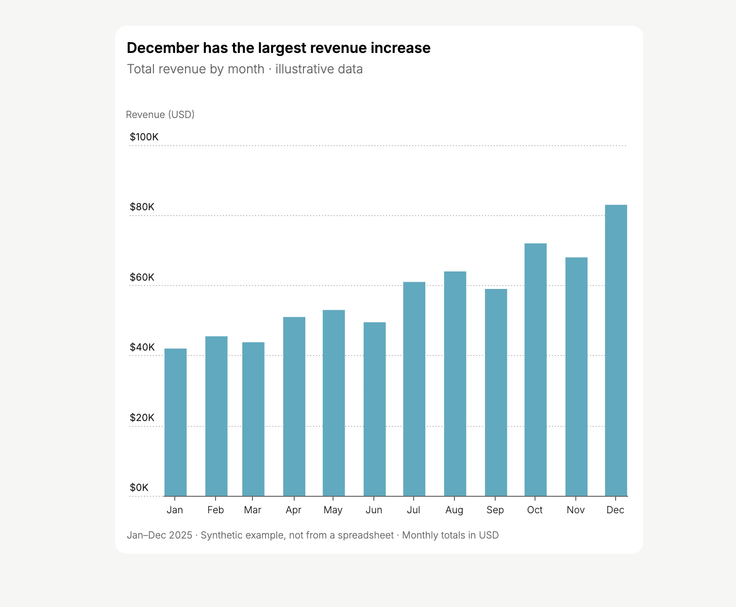
Bar chart of illustrative monthly revenue.
Line charts
Use a line chart to track change over time. Add separate lines to compare products, regions, or other groups using the same units.Create a line chart of monthly revenue for each product line. Use one line per product and identify when one overtakes the other.
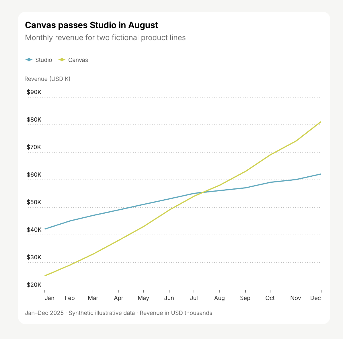
Line chart comparing two fictional product lines.
Stacked area charts
Use a stacked area chart to show both a total and its composition over time. Each band represents one part of the total.Show monthly membership by plan as a stacked area chart. Use member counts, not percentages, so I can see the total grow.Stack only values that can be added meaningfully. For example, use mutually exclusive membership categories rather than overlapping groups.
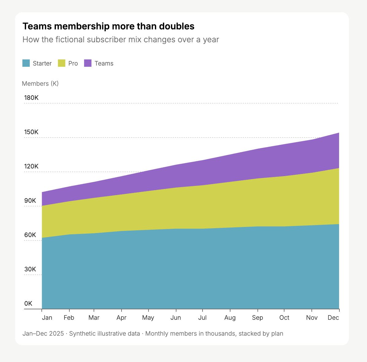
Stacked area chart of fictional membership categories, not Replit plan data.
Donut charts
Use a donut chart to show how a small set of categories contributes to a total. Ask for counts and percentages to make the shares clear.Create a donut chart showing orders by acquisition channel. Label each channel with its order count and percentage of all orders.
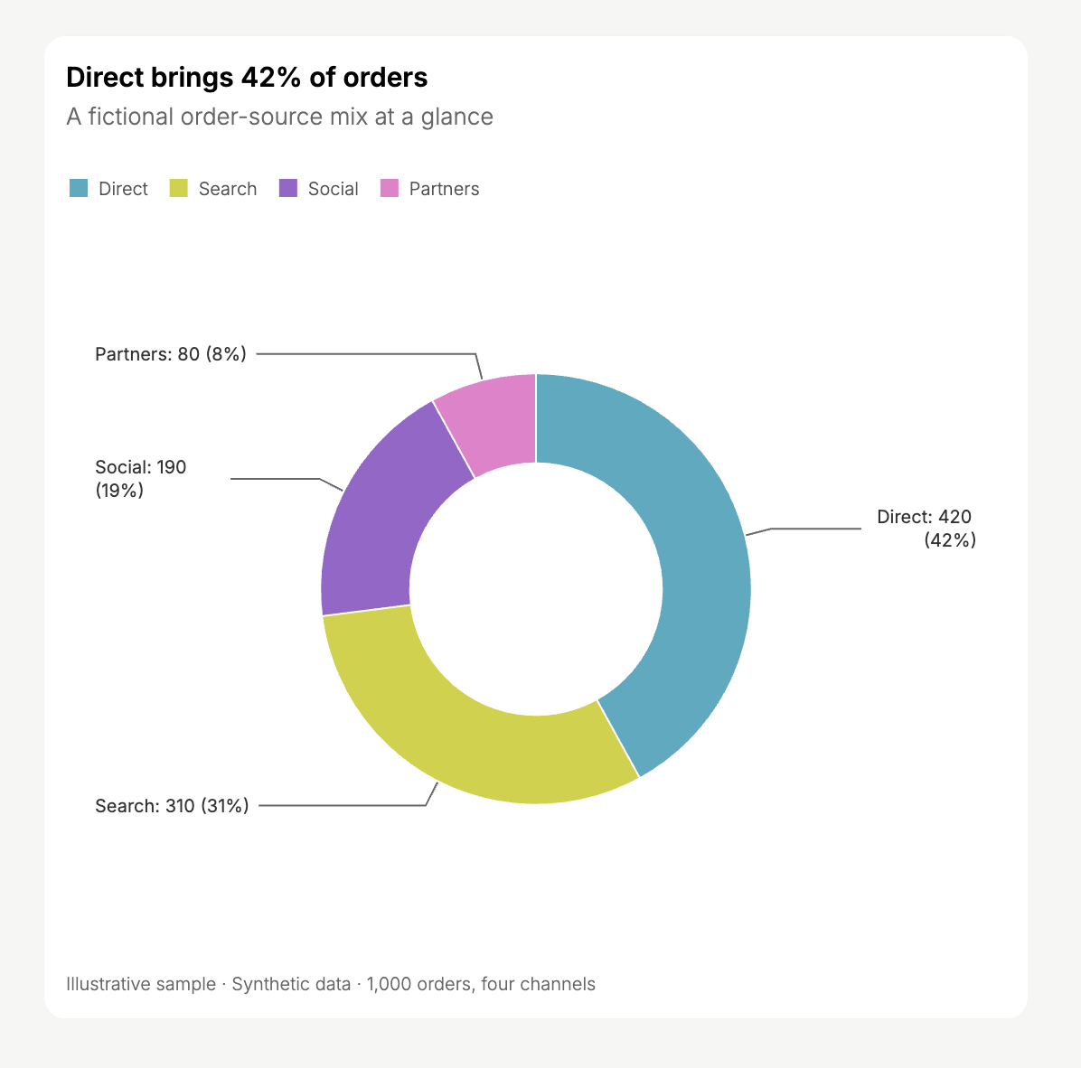
Donut chart of 1,000 illustrative orders by channel.
Sankey diagrams
Use a Sankey diagram to show flows between stages. The width of each connection represents a quantity, such as the number of people taking a path.Create a Sankey diagram from acquisition channel to selected plan to paid or trial outcome. Make each connection’s width represent the signup count.Provide counts for the connections between stages, not just separate totals for each category.
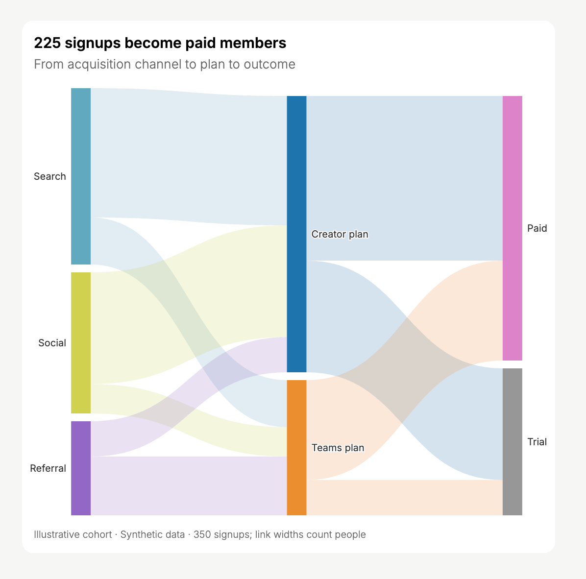
Sankey diagram of an illustrative cohort of 350 signups.
Heatmaps
Use a heatmap to find patterns across two dimensions. Color intensity represents a measure, such as the number of sessions in each day-and-hour combination.Create a heatmap of sessions by day of week and hour. State the timezone and highlight the busiest periods.
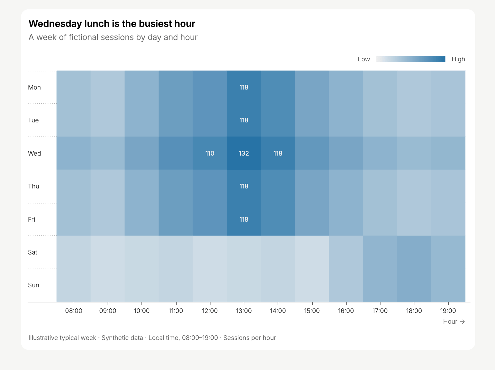
Heatmap of synthetic sessions during an illustrative week.
Provide data and refine the chart
Upload a dataset or connect a data source, then identify the records and date range to use. To avoid confusing sample data with your own records, include this instruction:Use only the data I provided. If no dataset is attached or accessible, ask me for it instead of generating sample data.You can continue in the same chat to change the chart type, grouping, labels, or comparison. For example:
- “Show a separate line for each region.”
- “Use weekly totals instead of daily totals.”
- “Replace the donut chart with a bar chart so I can compare similar values.”