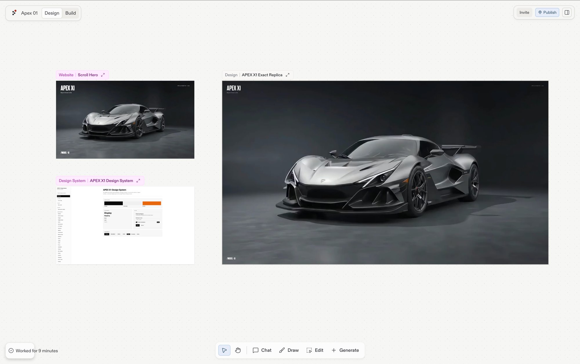
Frame kinds, the per-frame action bar, and the Build and Focus actions on Canvas.
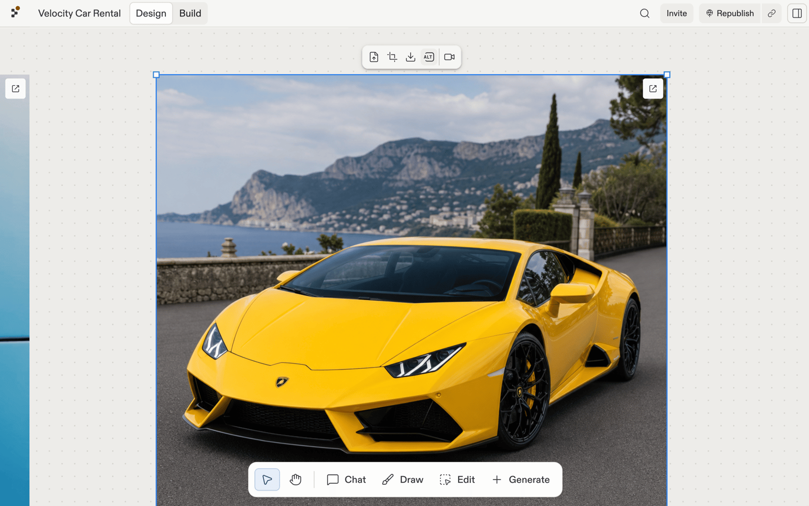
Every tile on the Canvas is a frame. Frames are what you select, drag, and act on. This page covers the frame kinds, the per-frame action bar that surfaces on selection, and the capabilities you trigger from it: Build and Focus.
Whether a Design frame behaves as a static image or an interactive prototype depends on the Interactive frames capability. When it’s enabled, Design frames respond to clicks and form input like a real page; otherwise they render as a snapshot you can iterate on but not click through.
See how a design looks on different screen sizes. Ask Agent to show you a mobile, tablet, or desktop version, for example “Show me the mobile version of this page”, and it renders a frame at that size:
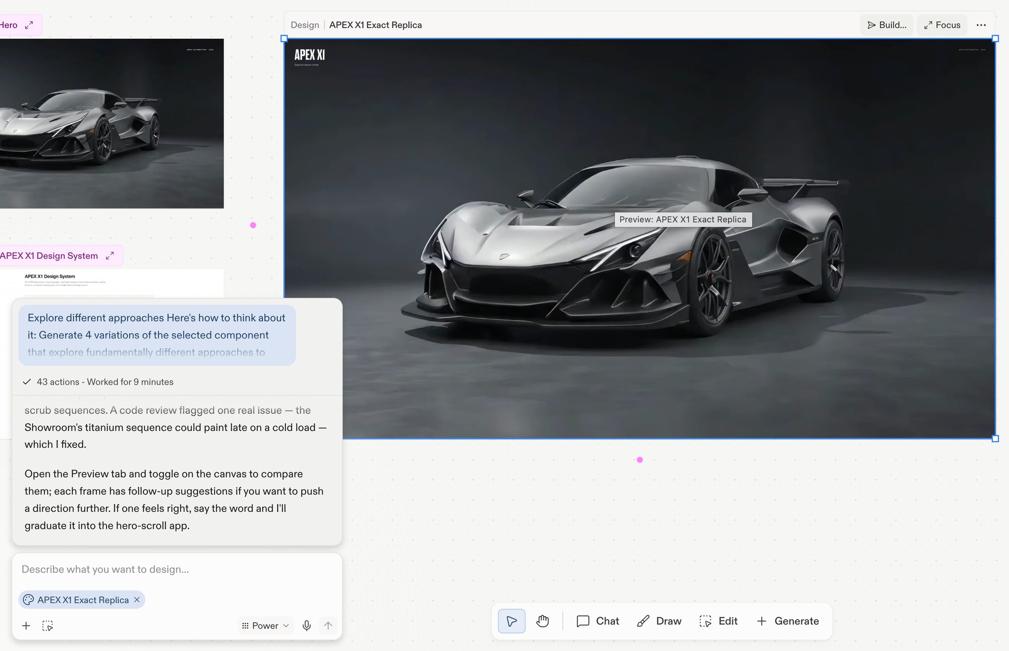
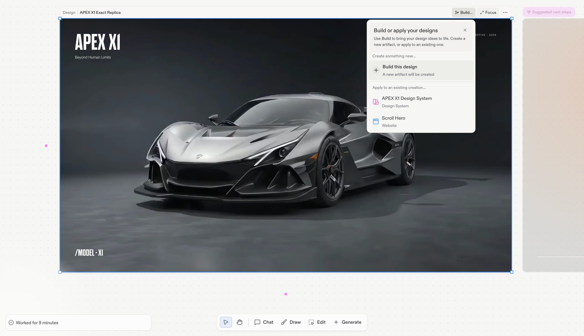
Opens a menu listing every Artifact in the project — choose one to apply the design to it, or choose Build this design to create a new Artifact. Design frames only. See Build.
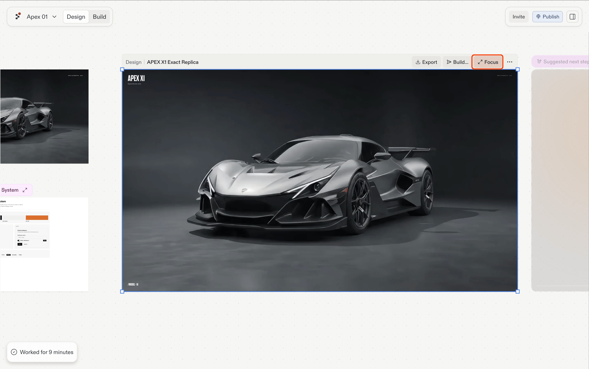
Focus
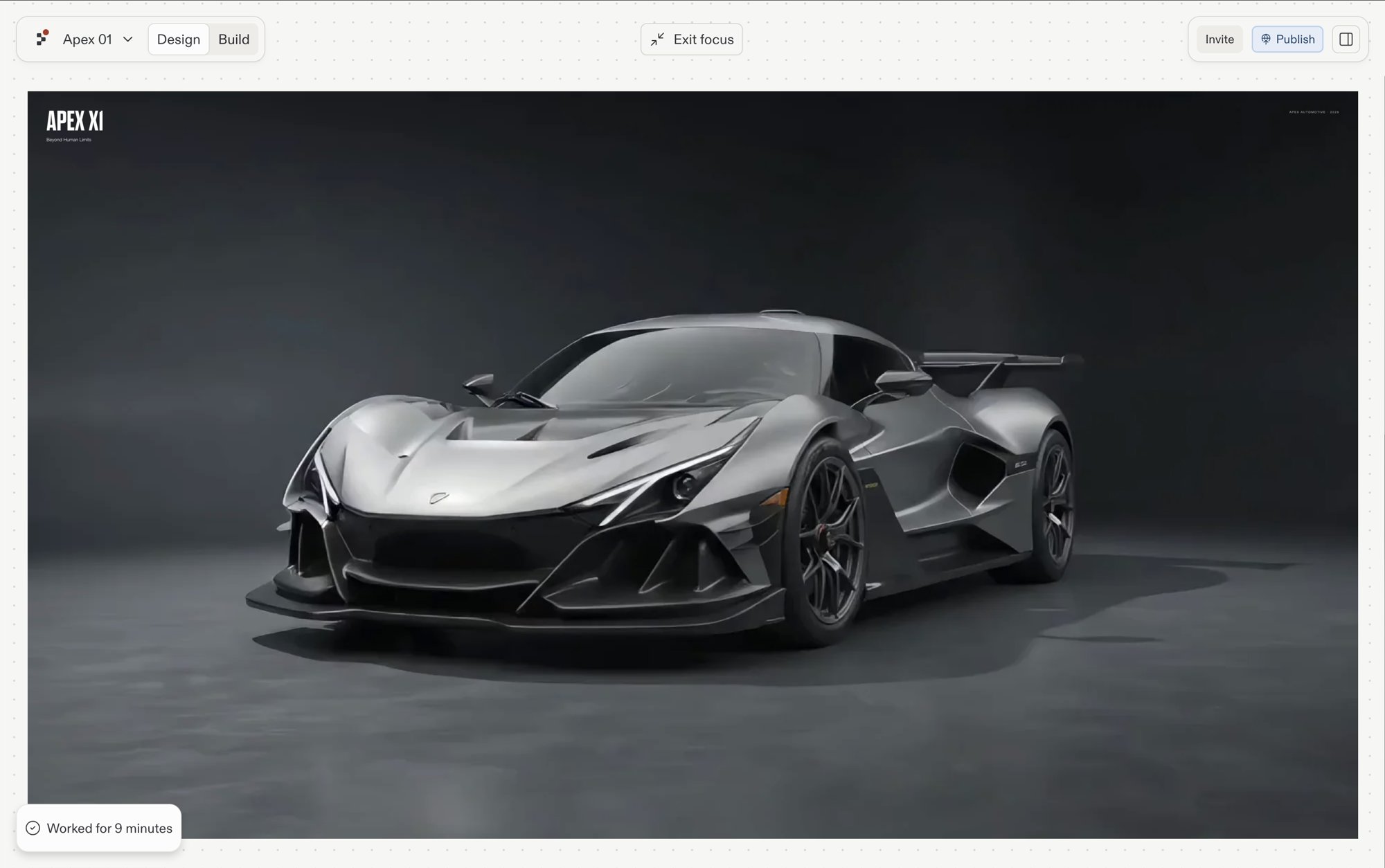
Enters focus mode, expanding the frame as the main view.
More (…)
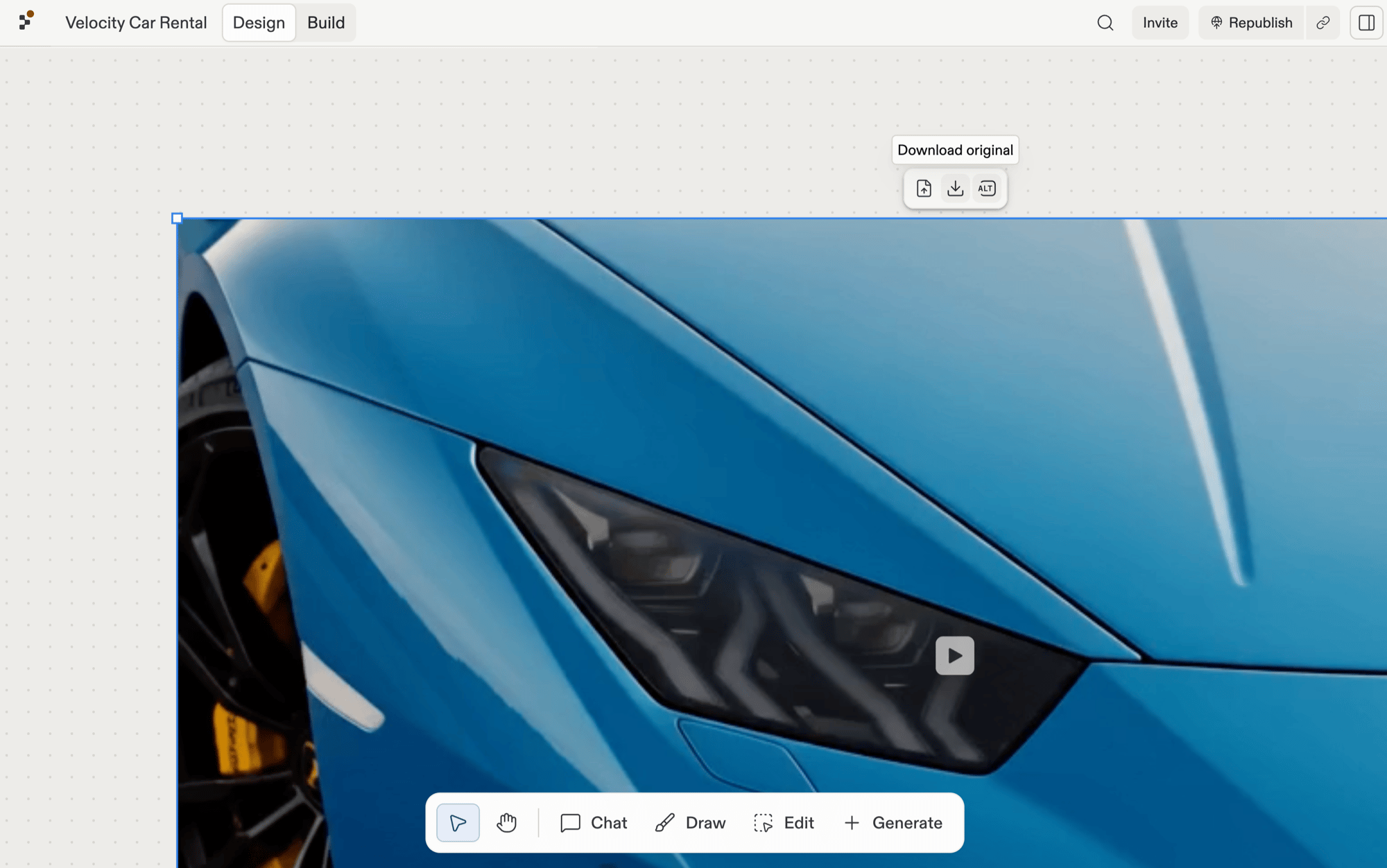
Additional frame actions. Copy, duplicate, reorder, and export also live in the board’s right-click menu.
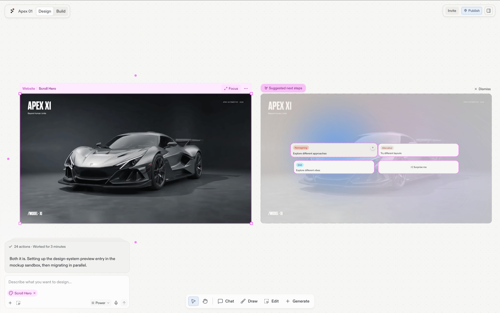
App frames (Website, Slides, Mobile app) show Focus and more options; Design frames add Build… before them. To branch new directions from a selected frame, follow its suggestions.Selecting a frame also attaches it to the next Agent chat message as a snapshot — see What lives on the canvas.
The action bar respects Read-only mode. When Canvas is locked inside a background-task context, the iteration actions hide and only Focus remains.
Selecting a frame surfaces suggestions beside it: one-click directions grounded in what you’re looking at, such as a different layout, a new vibe, or a page your design implies. Each one generates as a new frame alongside the source, so the original stays untouched and you can compare.
The Build… menu on a selected Design frame graduates the design into a live, running app. The same menu also covers applying the design to an Artifact that already exists.
Picking Build this design in the menu starts a new Artifact from the selected Design frame. The new Artifact lands in the project’s artifact list and becomes a live, running app. Build requires Core or Pro.
The Build… menu lists every Artifact in the project. Picking one applies the selected Design’s changes to that Artifact — Agent rewrites the Artifact’s code to match the design, leaving the Design frame on the Canvas for reference.