Design systems are available exclusively on the Enterprise plan. Only org admins can configure and manage design systems.
Why set up a design system
Without a design system, every builder needs to manually explain your component library, color tokens, and layout conventions to Agent. Setting up a design system solves this by:- Encoding your visual standards: Agent uses your exact components, colors, and spacing - not generic defaults
- Ensuring consistency: Every app follows the same design language
- Reducing onboarding time: New builders produce on-brand results immediately
- Capturing tribal knowledge: Design decisions and component usage patterns that live in your team’s heads get documented for Agent
What you will need
- Frontend code component library as a tarfile or set of tarfiles
- Font assets and icons used in your design system
- Any AI documentation of your design system (MCP, Agent Skills)
What you can configure
Setting up a design system involves three parts:-
Custom instructions. Your
custom_instruction/instructions.mdfile gives Agent the high-level rules that apply to every project: which component library to use, which design tokens to reference, and which patterns to follow. Agent always has this file in context. -
Skills. Skills in
.agents/skills/provide detailed reference material that Agent loads on demand. Use them for component API documentation, theming guides, layout pattern libraries, and other deep reference content that would be too large for the main instructions file. -
Design and brand assets. Place your logos, icons, fonts, and other brand assets in a dedicated folder (for example,
src/assets/brand/). Configure a Vite path alias so Agent and builders can reference them with clean imports like@brand/logo.svginstead of fragile relative paths. This keeps asset references consistent across the entire project.
Step-by-step guide
This guide walks you through setting up a design system end to end using your existing component library packaged as tarfiles:- Create a new Replit app and upload your tarfiles.
- Tell Replit Agent to install the packages and display all of the components. Agent will configure the project and render your component library.
- Review the output. Make sure all components look correct and match your expectations. Once everything is verified, proceed to Creating the design system skill.
Creating the design system skill
With your components ready, the final step is to create a design system skill so Agent can reference your components, tokens, and usage patterns in every project. Copy the entire prompt below and paste it into Agent. Replace<your-design-system-name> with the name of your design system:
Connect your skill to Agent
Once the skill is created, make sure yourcustom_instruction/instructions.md points Agent to it:
replit.md with design-system-specific context so Agent understands your visual standards from the start. Include a project overview, your preferred component library, key design preferences (spacing scale, accessibility requirements), and the architecture stack.
Validate your setup
Before rolling out your design system, verify these essentials:custom_instruction/instructions.mdpoints Agent to your design system skill.agents/skills/includes the skill with component references, guides, and packagesreplit.mdis pre-populated with project overview, preferences, and architecture- Design tokens file is included (
tokens.cssor equivalent) - Design system package is pre-installed in
package.json - Create a new test app and verify Agent uses the design system correctly
Pin the design system to your organization
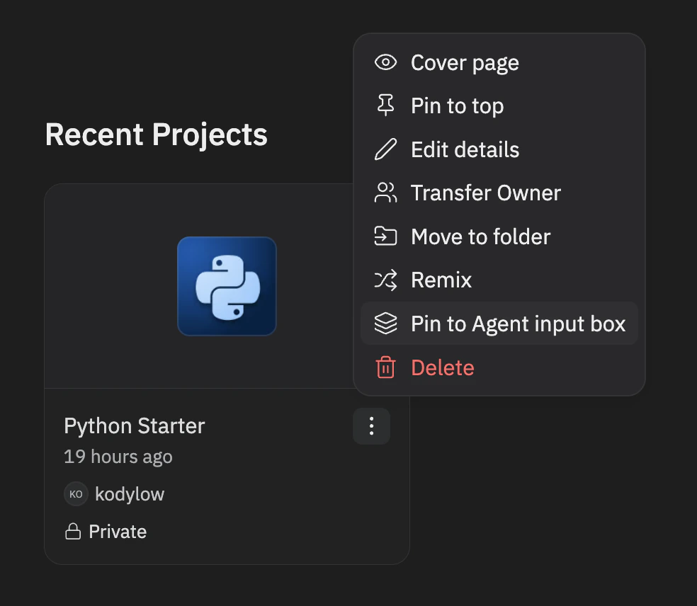
Once your design system is ready, pin it so every org member can use it:- Navigate to the design system app in your organization
- Open the app’s action menu (three-dot menu)
- Select Pin to Agent input box
Only org admins (members of the
system_admins role) can pin and unpin design systems.
Maintain your design system over time
Design systems evolve. Keep yours current:- Update token files when your design system ships new colors, spacing, or typography values
- Update skills when components get new props, variants, or usage patterns
- Update instructions when design principles or standards change
- Bump package versions when new releases of your design system ship
- Test regularly by creating a new app and verifying that Agent produces correct output
Design Systems vs. Custom Templates
Design systems and custom templates serve different purposes:
Use a design system when you want Agent to follow your visual standards across the normal Replit experience. Use a custom template when you need a fundamentally different stack.
Related resources
- Custom Templates - Set up entirely custom stacks for your organization
- Agent Skills - How skills work and how to create them
- Use a skill - Hands-on guide to using skills
- replit.md - Customize Agent behavior with project context
- Enterprise overview - Learn about Enterprise features