> ## Documentation Index
> Fetch the complete documentation index at: https://docs.replit.com/llms.txt
> Use this file to discover all available pages before exploring further.

# Free Mode를 최대한 활용하는 방법

> 일상적인 채팅, 생성, 빌드에서 Free Mode를 더 잘 활용하는 방법을 알아보세요.

export const FreeModePlanAvailability = `Free Mode is available on the Starter, Core, and Pro plans. Your Free Mode limits depend on your plan, and Core and Pro include an allowance that refreshes every ${FreeModeAllowanceRefreshPeriod}.`;

export const FreeModeCover = () => <>
    <style>{`
      .free-mode-cover {
        position: relative;
        display: grid;
        min-height: 360px;
        aspect-ratio: 16 / 10;
        overflow: hidden;
        place-items: center;
        margin: 28px 0 42px;
        border: 0;
        border-radius: 16px;
        padding: clamp(24px, 4vw, 44px);
        isolation: isolate;
        background:
          radial-gradient(circle at 50% -18%, rgba(255,255,255,.82), transparent 42%),
          radial-gradient(circle at 4% 96%, rgba(255,184,146,.48), transparent 38%),
          linear-gradient(140deg, #ff764d, #ff3c00 60%, #c92d00);
        box-sizing: border-box;
      }
      .free-mode-cover-panels {
        position: absolute;
        inset: 0;
        overflow: hidden;
        background:
          linear-gradient(180deg, rgba(255,255,255,.14), rgba(255,255,255,0) 48%, rgba(111,24,0,.2));
      }
      .free-mode-cover-panels span {
        position: absolute;
        display: block;
        border-radius: 999px;
        pointer-events: none;
      }
      .free-mode-cover-panels span:nth-child(1) {
        width: 62%;
        height: 54%;
        left: 19%;
        top: -34%;
        background: rgba(255, 255, 255, .2);
        filter: blur(30px);
      }
      .free-mode-cover-panels span:nth-child(2) {
        width: 48%;
        height: 58%;
        left: -20%;
        bottom: -28%;
        background: rgba(255, 203, 180, .34);
        filter: blur(36px);
      }
      .free-mode-cover-panels span:nth-child(3) {
        width: 44%;
        height: 60%;
        right: -18%;
        top: 20%;
        background: rgba(164, 32, 0, .2);
        filter: blur(44px);
      }
      .free-mode-cover-panels span:nth-child(4) {
        width: min(72%, 520px);
        height: 68%;
        left: 50%;
        top: 16%;
        transform: translateX(-50%) rotate(3deg);
        border: 1px solid rgba(255,255,255,.26);
        border-radius: 28px;
        background: transparent;
      }
      .free-mode-menu {
        position: relative;
        z-index: 1;
        width: min(66%, 660px);
        border: 1px solid rgba(255,255,255,.46);
        border-radius: 20px;
        background: linear-gradient(180deg, rgba(255,255,255,.25), rgba(255,255,255,.1));
        box-shadow: 0 22px 44px rgba(78,20,4,.22), inset 0 1px 0 rgba(255,255,255,.14);
        padding: 20px clamp(24px, 3.5vw, 34px);
        color: #fff;
        backdrop-filter: blur(7px) saturate(110%);
      }
      .free-mode-menu-label {
        margin: 0 0 8px;
        font-size: clamp(13px, 1.5vw, 17px);
        font-weight: 600;
        letter-spacing: .02em;
        text-transform: uppercase;
      }
      .free-mode-row {
        display: grid;
        grid-template-columns: 18px minmax(0, 1fr);
        gap: 18px;
        align-items: start;
        margin: 0;
        padding: 8px 0;
        color: #fff !important;
      }
      .free-mode-row-dot {
        width: 10px;
        height: 10px;
        margin-top: 8px;
        border: 2px solid currentColor;
        border-radius: 999px;
        box-sizing: border-box;
      }
      .free-mode-row strong {
        display: block;
        font-size: clamp(21px, 2.2vw, 27px);
        font-weight: 500;
        letter-spacing: -.025em;
        line-height: 1.1;
        color: inherit !important;
      }
      .free-mode-row p {
        margin: 4px 0 0;
        font-size: clamp(13px, 1.45vw, 16px);
        line-height: 1.4;
        color: inherit !important;
      }
      .free-mode-row.is-selected {
        width: calc(100% + 96px);
        margin: 0 0 0 -48px;
        border-radius: 18px;
        background: #fff1ed;
        padding: 13px 28px;
        color: #746c69 !important;
        box-shadow: 0 18px 34px rgba(116,39,18,.13);
        box-sizing: border-box;
      }
      .free-mode-row.is-selected .free-mode-row-dot {
        border-color: #746c69;
        background: #746c69;
      }
      @media (max-width: 640px) {
        .free-mode-cover { min-height: 390px; aspect-ratio: auto; padding: 24px 18px; }
        .free-mode-menu { width: 92%; padding: 28px 22px; }
        .free-mode-row { gap: 12px; padding: 15px 0; }
        .free-mode-row.is-selected { width: calc(100% + 24px); margin-left: -12px; padding: 18px 16px; }
      }
    `}</style>
    <div className="free-mode-cover" role="img" aria-label="Agent Modes menu with Free Mode selected above Power Mode and Max Mode">
      <div className="free-mode-cover-panels" aria-hidden="true">
        <span />
        <span />
        <span />
        <span />
      </div>
      <div className="free-mode-menu" aria-hidden="true">
        <div className="free-mode-menu-label">Agent Modes</div>
        <div className="free-mode-row is-selected">
          <span className="free-mode-row-dot" />
          <div>
            <strong>Free</strong>
            <p>Great for everyday tasks and quick edits.</p>
          </div>
        </div>
        <div className="free-mode-row">
          <span className="free-mode-row-dot" />
          <div>
            <strong>Power</strong>
            <p>A smart balance of speed and capability for most work.</p>
          </div>
        </div>
        <div className="free-mode-row">
          <span className="free-mode-row-dot" />
          <div>
            <strong>Max</strong>
            <p>The most capable models for complex, ambitious builds.</p>
          </div>
        </div>
      </div>
    </div>
  </>;

export const PromptingCardVisual = () => <div className="chat-use-case-visual" aria-hidden="true" style={{
  background: "radial-gradient(circle at 48% -30%, rgba(255,255,255,.78), transparent 54%), linear-gradient(140deg, #ff764d, #ff3c00 60%, #c92d00)"
}}>
    <div style={{
  position: "relative",
  width: "72%",
  margin: "auto",
  padding: 12,
  border: "1px solid rgba(255,255,255,.56)",
  borderRadius: 14,
  background: "rgba(255,255,255,.2)"
}}>
      <span style={{
  display: "block",
  width: "66%",
  height: 7,
  borderRadius: 999,
  background: "rgba(255,255,255,.8)"
}} />
      <span style={{
  display: "block",
  width: "92%",
  height: 7,
  marginTop: 7,
  borderRadius: 999,
  background: "rgba(255,255,255,.38)"
}} />
      <span style={{
  display: "block",
  width: "82%",
  height: 22,
  marginTop: 12,
  border: "1px solid rgba(255,255,255,.62)",
  borderRadius: 8,
  background: "rgba(255,255,255,.16)"
}} />
    </div>
  </div>;

<FreeModeCover />

<p>
  {FreeModePlanAvailability}
</p>

Free Mode를 사용하면 Power Mode나 Max Mode 크레딧을 사용하지 않고도 채팅, 생성, 빌드를 할 수 있습니다.
<Note>
  Free Mode는 항상 Auto를 사용하므로 Replit이 요청에 맞는 모델을 선택합니다. Free
  Mode에서는 특정 모델을 선택할 수 없습니다.
</Note>

Routine은 Free Mode에서 실행되지 않습니다. Power Mode 또는 Max Mode에서 실행되며 실행마다 예산이 필요합니다. 자세한 내용은 [Routine](/chat/routines)을 참고하세요.

## 허용량을 더 잘 활용하기

Free Mode는 지금 진행 중인 작업의 추진력을 유지하기 좋은 곳입니다. 다음과 같은 경우에 활용하세요.

* 더 큰 빌드에 나서기 전에 아이디어를 탐색하고 검증합니다.
* 새 프로젝트를 시작하거나, 기능을 처음 시도해보거나, 작은 변경 작업을 진행합니다.
* 질문하고, 계획을 세우고, 후속 메시지를 통해 작업을 다듬습니다.
* 허용량이 남아 있는 동안 크레딧을 사용하지 않고 일상적인 작업을 계속합니다.

시작하려면 프롬프트 입력창 아래의 모드 선택기를 열고 모드가 **Free**로 설정되어 있는지 확인하세요. 그런 다음 Replit에 초점이 명확한 요청을 전달하세요. 원하는 결과를 명시하고, 중요한 컨텍스트를 공유하고, 후속 질문으로 결과를 다듬으세요.

## 다른 모드를 사용할 때를 알아두기

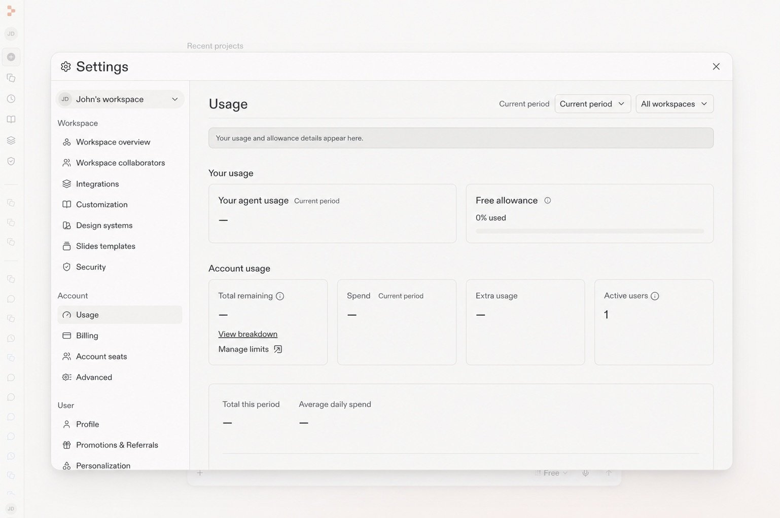
Free Mode 제한은 플랜에 따라 다릅니다. **Settings** → **Usage**를 열어 현재 제한과 갱신 시점을 확인하세요.

<Frame caption="Usage 페이지에는 남은 Free 허용량과 갱신 시점이 표시됩니다.">
  <img src="https://mintcdn.com/replit/teDUL4A-lNO7dv1O/images/chat/free-mode-usage-sanitized.jpg?fit=max&auto=format&n=teDUL4A-lNO7dv1O&q=85&s=d0538032632b4201a99f555f47999333" alt="Free 허용량 패널이 표시된 Settings의 Usage 페이지" width="1538" height="1022" data-path="images/chat/free-mode-usage-sanitized.jpg" />
</Frame>

Core 및 Pro 플랜에서는 더 높은 성능이 필요하거나, 특정 모델을 선택하고 싶거나, Free Mode 허용량에 도달했을 때 **Power Mode** 또는 **Max Mode**로 전환하세요. 이 모드들은 월간 크레딧을 사용합니다. Starter의 빌더는 Power Mode 또는 Max Mode를 사용하기 전에 업그레이드해야 합니다.

<Tip>
  플랜에 Power Mode와 Max Mode가 포함되어 있다면, 첫 단계에는 Free Mode를 사용하고
  작업에 더 높은 성능이 필요할 때만 전환하세요. 요청이 사용 비용이 발생하는
  모드로 전환되기 전에 Replit이 알려줍니다.
</Tip>

## 작업에 맞는 모드 선택하기

| 하려는 작업이...                   | 시작할 모드     |
| ---------------------------- | ---------- |
| 탐색하기, 질문하기, 계획하기, 또는 빌드 시작하기 | Free Mode  |
| 대부분의 작업에서 속도와 성능의 강력한 균형 얻기  | Power Mode |
| 복잡하거나 도전적인 작업 처리하기           | Max Mode   |

Power Mode는 동일한 비용으로 Economy Mode를 대체하며, 동등하거나 더 나은 성능을 제공합니다. Core 및 Pro 플랜에서는 Power Mode 또는 Max Mode에서 **Auto**를 끄고 사용 가능한 모델을 선택할 수 있습니다.

## 더 알아보기

<section className="chat-mkt chat-workflow-grid has-visuals">
  <a className="chat-example has-visual" href="/ko/features/agent/agent-modes#free-mode">
    <div className="chat-use-case-visual palette-ink">
      <div className="chat-use-case-window">
        <i />

        <i />

        <i />

        <b />

        <b />

        <b />
      </div>

      <em>
        <Icon icon="bolt" size={24} />
      </em>
    </div>

    <span>
      <Icon icon="bolt" size={19} />
    </span>

    <div className="chat-card-title">Free Mode 참조</div>
    <p>Free Mode가 Power Mode, Max Mode와 어떻게 연계되는지 확인하세요.</p>
    <div className="chat-card-link">참조 문서 열기 →</div>
  </a>

  <a className="chat-example has-visual" href="/chat/prompting">
    <PromptingCardVisual />

    <span>
      <Icon icon="comment-dots" size={19} />
    </span>

    <div className="chat-card-title">프롬프트 작성하기</div>
    <p>Replit에 유용한 방향과 컨텍스트를 제공하는 방법을 알아보세요.</p>
    <div className="chat-card-link">계속 읽기 →</div>
  </a>
</section>

다음으로 [Auto Mode](/chat/auto-mode)가 작업 변화에 따라 모델을 선택하는 방법을 알아보세요.
