> ## Documentation Index
> Fetch the complete documentation index at: https://docs.replit.com/llms.txt
> Use this file to discover all available pages before exploring further.

# フリーモードを最大限に活用する

> 日々のチャット、作成、構築でフリーモードをより活用する方法を学びます。

export const FreeModePlanAvailability = `Free Mode is available on the Starter, Core, and Pro plans. Your Free Mode limits depend on your plan, and Core and Pro include an allowance that refreshes every ${FreeModeAllowanceRefreshPeriod}.`;

export const FreeModeCover = () => <>
    <style>{`
      .free-mode-cover {
        position: relative;
        display: grid;
        min-height: 360px;
        aspect-ratio: 16 / 10;
        overflow: hidden;
        place-items: center;
        margin: 28px 0 42px;
        border: 0;
        border-radius: 16px;
        padding: clamp(24px, 4vw, 44px);
        isolation: isolate;
        background:
          radial-gradient(circle at 50% -18%, rgba(255,255,255,.82), transparent 42%),
          radial-gradient(circle at 4% 96%, rgba(255,184,146,.48), transparent 38%),
          linear-gradient(140deg, #ff764d, #ff3c00 60%, #c92d00);
        box-sizing: border-box;
      }
      .free-mode-cover-panels {
        position: absolute;
        inset: 0;
        overflow: hidden;
        background:
          linear-gradient(180deg, rgba(255,255,255,.14), rgba(255,255,255,0) 48%, rgba(111,24,0,.2));
      }
      .free-mode-cover-panels span {
        position: absolute;
        display: block;
        border-radius: 999px;
        pointer-events: none;
      }
      .free-mode-cover-panels span:nth-child(1) {
        width: 62%;
        height: 54%;
        left: 19%;
        top: -34%;
        background: rgba(255, 255, 255, .2);
        filter: blur(30px);
      }
      .free-mode-cover-panels span:nth-child(2) {
        width: 48%;
        height: 58%;
        left: -20%;
        bottom: -28%;
        background: rgba(255, 203, 180, .34);
        filter: blur(36px);
      }
      .free-mode-cover-panels span:nth-child(3) {
        width: 44%;
        height: 60%;
        right: -18%;
        top: 20%;
        background: rgba(164, 32, 0, .2);
        filter: blur(44px);
      }
      .free-mode-cover-panels span:nth-child(4) {
        width: min(72%, 520px);
        height: 68%;
        left: 50%;
        top: 16%;
        transform: translateX(-50%) rotate(3deg);
        border: 1px solid rgba(255,255,255,.26);
        border-radius: 28px;
        background: transparent;
      }
      .free-mode-menu {
        position: relative;
        z-index: 1;
        width: min(66%, 660px);
        border: 1px solid rgba(255,255,255,.46);
        border-radius: 20px;
        background: linear-gradient(180deg, rgba(255,255,255,.25), rgba(255,255,255,.1));
        box-shadow: 0 22px 44px rgba(78,20,4,.22), inset 0 1px 0 rgba(255,255,255,.14);
        padding: 20px clamp(24px, 3.5vw, 34px);
        color: #fff;
        backdrop-filter: blur(7px) saturate(110%);
      }
      .free-mode-menu-label {
        margin: 0 0 8px;
        font-size: clamp(13px, 1.5vw, 17px);
        font-weight: 600;
        letter-spacing: .02em;
        text-transform: uppercase;
      }
      .free-mode-row {
        display: grid;
        grid-template-columns: 18px minmax(0, 1fr);
        gap: 18px;
        align-items: start;
        margin: 0;
        padding: 8px 0;
        color: #fff !important;
      }
      .free-mode-row-dot {
        width: 10px;
        height: 10px;
        margin-top: 8px;
        border: 2px solid currentColor;
        border-radius: 999px;
        box-sizing: border-box;
      }
      .free-mode-row strong {
        display: block;
        font-size: clamp(21px, 2.2vw, 27px);
        font-weight: 500;
        letter-spacing: -.025em;
        line-height: 1.1;
        color: inherit !important;
      }
      .free-mode-row p {
        margin: 4px 0 0;
        font-size: clamp(13px, 1.45vw, 16px);
        line-height: 1.4;
        color: inherit !important;
      }
      .free-mode-row.is-selected {
        width: calc(100% + 96px);
        margin: 0 0 0 -48px;
        border-radius: 18px;
        background: #fff1ed;
        padding: 13px 28px;
        color: #746c69 !important;
        box-shadow: 0 18px 34px rgba(116,39,18,.13);
        box-sizing: border-box;
      }
      .free-mode-row.is-selected .free-mode-row-dot {
        border-color: #746c69;
        background: #746c69;
      }
      @media (max-width: 640px) {
        .free-mode-cover { min-height: 390px; aspect-ratio: auto; padding: 24px 18px; }
        .free-mode-menu { width: 92%; padding: 28px 22px; }
        .free-mode-row { gap: 12px; padding: 15px 0; }
        .free-mode-row.is-selected { width: calc(100% + 24px); margin-left: -12px; padding: 18px 16px; }
      }
    `}</style>
    <div className="free-mode-cover" role="img" aria-label="Agent Modes menu with Free Mode selected above Power Mode and Max Mode">
      <div className="free-mode-cover-panels" aria-hidden="true">
        <span />
        <span />
        <span />
        <span />
      </div>
      <div className="free-mode-menu" aria-hidden="true">
        <div className="free-mode-menu-label">Agent Modes</div>
        <div className="free-mode-row is-selected">
          <span className="free-mode-row-dot" />
          <div>
            <strong>Free</strong>
            <p>Great for everyday tasks and quick edits.</p>
          </div>
        </div>
        <div className="free-mode-row">
          <span className="free-mode-row-dot" />
          <div>
            <strong>Power</strong>
            <p>A smart balance of speed and capability for most work.</p>
          </div>
        </div>
        <div className="free-mode-row">
          <span className="free-mode-row-dot" />
          <div>
            <strong>Max</strong>
            <p>The most capable models for complex, ambitious builds.</p>
          </div>
        </div>
      </div>
    </div>
  </>;

export const PromptingCardVisual = () => <div className="chat-use-case-visual" aria-hidden="true" style={{
  background: "radial-gradient(circle at 48% -30%, rgba(255,255,255,.78), transparent 54%), linear-gradient(140deg, #ff764d, #ff3c00 60%, #c92d00)"
}}>
    <div style={{
  position: "relative",
  width: "72%",
  margin: "auto",
  padding: 12,
  border: "1px solid rgba(255,255,255,.56)",
  borderRadius: 14,
  background: "rgba(255,255,255,.2)"
}}>
      <span style={{
  display: "block",
  width: "66%",
  height: 7,
  borderRadius: 999,
  background: "rgba(255,255,255,.8)"
}} />
      <span style={{
  display: "block",
  width: "92%",
  height: 7,
  marginTop: 7,
  borderRadius: 999,
  background: "rgba(255,255,255,.38)"
}} />
      <span style={{
  display: "block",
  width: "82%",
  height: 22,
  marginTop: 12,
  border: "1px solid rgba(255,255,255,.62)",
  borderRadius: 8,
  background: "rgba(255,255,255,.16)"
}} />
    </div>
  </div>;

<FreeModeCover />

<p>
  {FreeModePlanAvailability}
</p>

フリーモードでは、パワーモードやマックスモードのクレジットを使わずにチャット、作成、構築ができます。
<Note>
  フリーモードは常にAutoを使用するため、Replitがリクエストに応じてモデルを選択します。フリーモードでは特定のモデルを選択できません。
</Note>

ルーティンはフリーモードでは実行されません。パワーモードまたはマックスモードで実行され、実行ごとの予算が必要です。詳しくは[ルーティン](/chat/routines)を参照してください。

## 利用枠をより活用する

フリーモードは、目の前の作業の勢いを保つのに適した場所です。次のような場面で活用しましょう。

* より大きな構築に取り組む前に、アイデアを探求し検証する。
* 新しいプロジェクトを始める、機能の最初の試作をする、または小さな変更に取り組む。
* 質問し、計画を作成し、フォローアップメッセージを通じて作業を改善する。
* 利用枠が使える間、クレジットを使わずに日々の作業を続ける。

始めるには、プロンプトボックスの下にあるモードセレクターを開き、モードが **Free** に設定されていることを確認します。そして、Replitに焦点を絞ったリクエストを伝えましょう。求める結果を明示し、重要なコンテキストを共有し、フォローアップの質問で結果を改善します。

## 別のモードを使うタイミングを知る

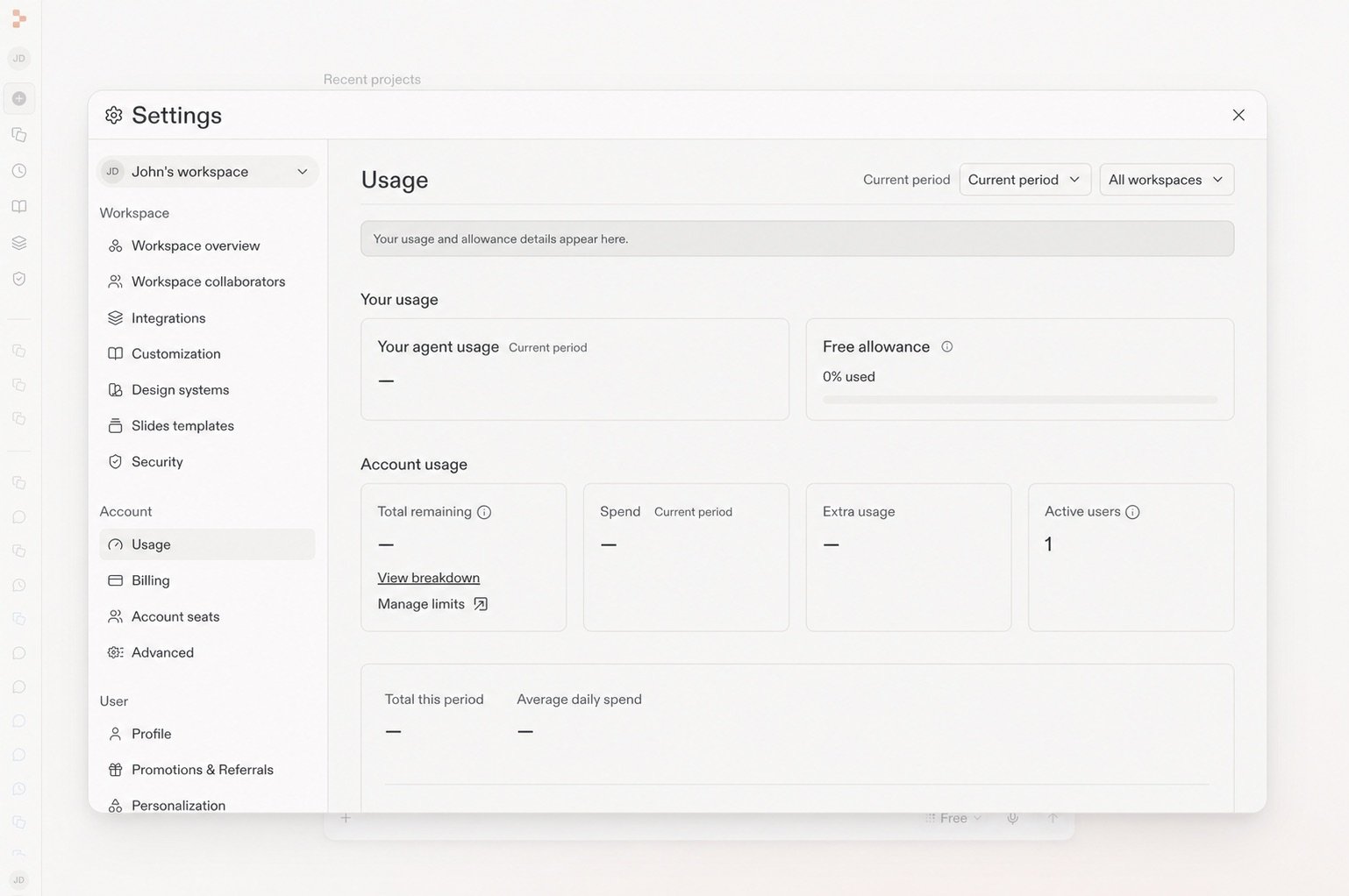
フリーモードの上限はプランによって異なります。**設定** → **使用状況** を開いて、現在の上限とリセットのタイミングを確認してください。

<Frame caption="使用状況ページには残りのフリー利用枠と更新タイミングが表示されます。">
  <img src="https://mintcdn.com/replit/teDUL4A-lNO7dv1O/images/chat/free-mode-usage-sanitized.jpg?fit=max&auto=format&n=teDUL4A-lNO7dv1O&q=85&s=d0538032632b4201a99f555f47999333" alt="フリー利用枠パネルが表示された設定の使用状況ページ" width="1538" height="1022" data-path="images/chat/free-mode-usage-sanitized.jpg" />
</Frame>

CoreプランおよびProプランでは、より高い能力が必要なとき、特定のモデルを選びたいとき、またはフリーモードの利用枠に達したときに **パワーモード** または **マックスモード** に切り替えます。これらのモードは月間クレジットを使用します。Starterプランのビルダーは、パワーモードまたはマックスモードを使う前にアップグレードが必要です。

<Tip>
  プランにパワーモードとマックスモードが含まれる場合は、最初のステップにフリーモードを使い、タスクがより高い能力を必要とするときだけ切り替えましょう。リクエストが利用コストの発生するモードに切り替わる前に、Replitが通知します。
</Tip>

## 作業に合ったモードを選ぶ

| やりたいことが...               | 始めるモード  |
| ------------------------ | ------- |
| 探求する、質問する、計画する、または構築を始める | フリーモード  |
| ほとんどの作業に適した速度と能力のバランスを得る | パワーモード  |
| 複雑または野心的な作業に取り組む         | マックスモード |

パワーモードは同じコストでエコノミーモードを置き換え、同等以上の性能を提供します。CoreプランおよびProプランでは、パワーモードまたはマックスモードで **Auto** をオフにして、利用可能なモデルを選択できます。

## さらに詳しく

<section className="chat-mkt chat-workflow-grid has-visuals">
  <a className="chat-example has-visual" href="/ja/features/agent/agent-modes#free-mode">
    <div className="chat-use-case-visual palette-ink">
      <div className="chat-use-case-window">
        <i />

        <i />

        <i />

        <b />

        <b />

        <b />
      </div>

      <em>
        <Icon icon="bolt" size={24} />
      </em>
    </div>

    <span>
      <Icon icon="bolt" size={19} />
    </span>

    <div className="chat-card-title">フリーモードのリファレンス</div>
    <p>フリーモードがパワーモードやマックスモードとどう関係するかを確認します。</p>
    <div className="chat-card-link">リファレンスを開く →</div>
  </a>

  <a className="chat-example has-visual" href="/chat/prompting">
    <PromptingCardVisual />

    <span>
      <Icon icon="comment-dots" size={19} />
    </span>

    <div className="chat-card-title">プロンプティング</div>
    <p>Replitに有用な方向性とコンテキストを与える方法を学びます。</p>
    <div className="chat-card-link">続きを見る →</div>
  </a>
</section>

次に、タスクの変化に応じて[Autoモード](/chat/auto-mode)がどのようにモデルを選択するかを学びましょう。
