> ## Documentation Index
> Fetch the complete documentation index at: https://docs.replit.com/llms.txt
> Use this file to discover all available pages before exploring further.
# Replit에 오신 것을 환영합니다
> Replit은 아이디어에서 앱, 웹사이트, 대시보드, 모바일 경험, 슬라이드 덱, 동영상, 프로토타입으로 가는 가장 빠른 방법입니다.
export const YouTubeEmbed = ({videoId, title = "YouTube video", startAt}) => {
if (!videoId) {
return null;
}
let url = "https://www.youtube.com/embed/" + videoId;
if (startAt) {
url = url + "?start=" + startAt;
}
return
;
};
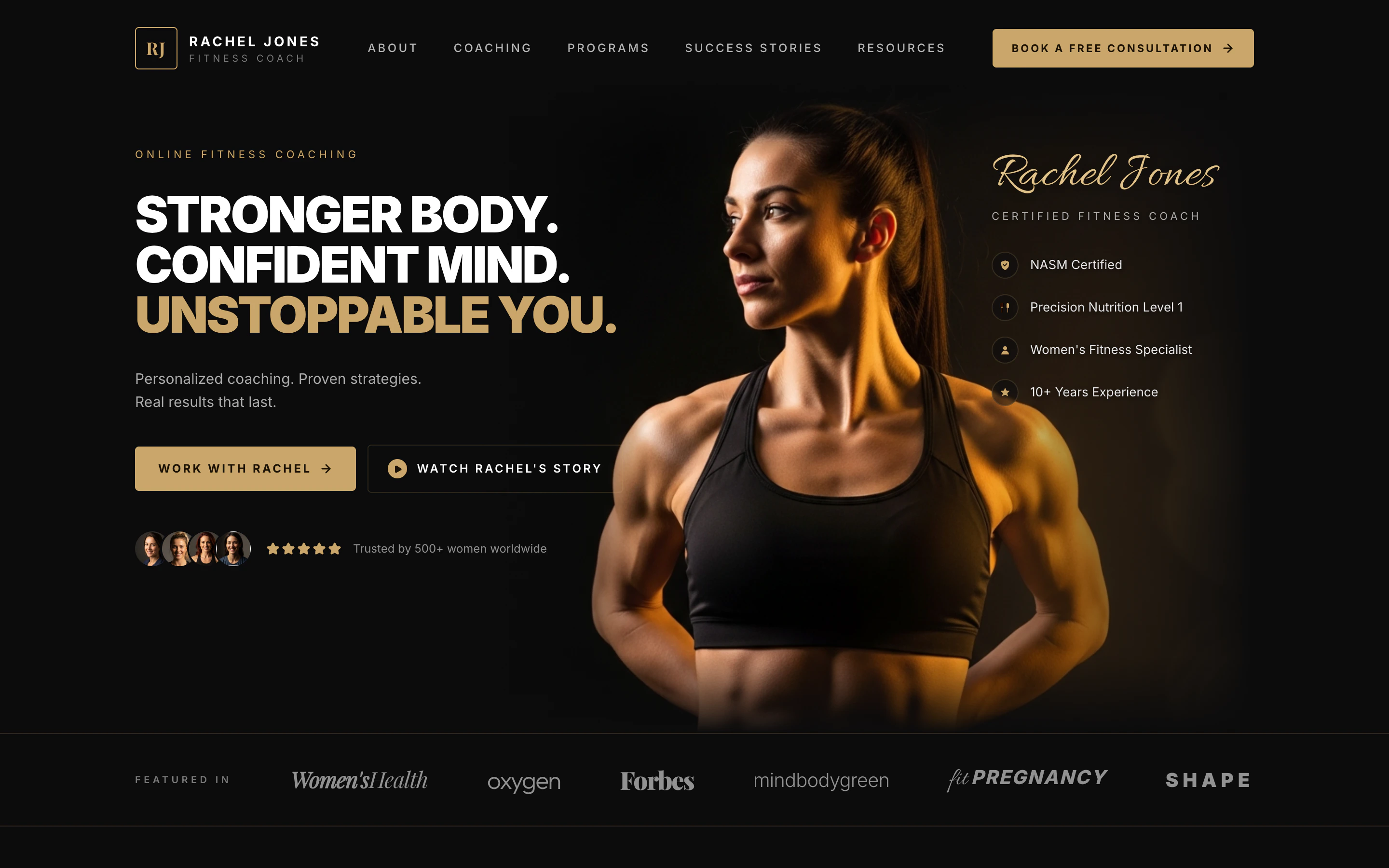
export const RACHEL_JONES_PROMPT = `Build me a one-page website for an online fitness coach named Rachel Jones. It should feel premium, like a magazine ad — dark, moody, and luxurious, with black and warm gold as the only colors. Big bold headlines, lots of empty space, and elegant serif accents. No bright colors, no rounded "tech startup" vibes.
Here's what should be on the page, top to bottom:
A header bar with a small gold "RJ" logo on the left, the words "RACHEL JONES — FITNESS COACH" next to it, a few menu links across the middle (About, Coaching, Programs, Success Stories, Resources), and a gold "Book a Free Consultation" button on the right.
A huge hero section with a dramatic close-up photo of a strong, fit woman lit with warm gold light against a black background. On the left side over the dark area, put a giant three-line headline:
"STRONGER BODY. CONFIDENT MIND. UNSTOPPABLE YOU." — with the last line in gold.
Underneath: "Personalized coaching. Proven strategies. Real results that last." Then two buttons: a gold "Work With Rachel" and an outlined "Watch Rachel's Story" with a play icon. Below that, show 4 little circular client photos and 5 gold stars with the line "Trusted by 500+ women worldwide."
On the right side, layered on the photo, write "Rachel Jones" in a fancy gold script font, with "CERTIFIED FITNESS COACH" underneath, and a list of credentials with little gold icons: NASM Certified, Precision Nutrition Level 1, Women's Fitness Specialist, 10+ Years Experience.
A "Featured In" strip — a thin row showing fake magazine logos written in different fancy fonts: Women's Health, Oxygen, Forbes, mindbodygreen, Fit Pregnancy, Shape.
A "Holistic Approach" section — centered headline "A Holistic Approach. Real Results." in an elegant serif. Below it, four columns side by side, each with a small gold icon, a title, and a one-line description: Custom Training, Nutrition Guidance, Mindset Coaching, Accountability.
A "Success Stories" section — on the left, the headline "Stronger on the Outside. Stronger on the Inside." with a "See More Success Stories" button. On the right, three before/after transformation photos of women, each with a big gold result number underneath ("−24 LBS in 16 weeks", "+18 LBS of muscle", "−20% body fat in 14 weeks"), a short italic quote, and the client's first name.
A final call-to-action panel — a wide dark card split into three parts. Left: a friendly portrait of Rachel. Middle: headline "You Don't Need More Motivation. You Need the Right Plan." with a gold "Book Your Free Consultation" button. Right: three small benefits with icons — "1:1 Strategy Call", "Personalized Plan", "Start Your Transformation".
For the photos, generate them — I want a fit woman with warm gold dramatic lighting on a black background, very cinematic. The before/after photos should be full-body in the same dark studio style.
Make it look like a real, professional coaching brand — not a template. Don't add forms, signups, or extra pages — just this one beautiful landing page.`;
export const PACE_PROMPT = `Build me a personal running web app called "Pace".
I want a clean, modern web app where I can track my runs and see my progress at a glance — a friendlier, more visual version of a running journal like Strava or Nike Run Club, but simpler and prettier. It only needs to support one user (me) for now, and my profile name should be Alex Morgan. Pre-fill it with about a month of pretend running history so it looks alive from the moment I open it — runs through San Francisco, a mix of easy runs, tempo runs, long runs, and recovery runs, with at least 4–5 runs in the past week so the dashboard looks active.
The app should run in any modern browser, feel fast, and be fully responsive — great on desktop, tablet, and phone.
Look and feel
The vibe is sporty, premium, "athletic brand" — black, white, and a punchy lime green as the accent color. Use the Inter font everywhere. Rounded corners on everything (cards, buttons, pills). It should feel calm and uncluttered, not busy. Light mode by default. Smooth, subtle animations when pages transition, when cards appear, and when I click buttons — it should feel responsive and alive, not stiff.
Overall navigation
A top nav bar with the Pace logo on the left and 5 links across the middle: Home, Runs, Plan, Stats, Profile. The active link has a lime underline; inactive links are gray. On the right: a lime "Log a Run" button (always visible) and a round profile photo (clicking it opens Profile).
On smaller screens, the middle nav links collapse into a hamburger menu, but the lime "Log a Run" button stays visible.
The Home page (the main page) — a scrollable feed, top to bottom:
Greeting. A friendly greeting that changes with the time of day ("Good morning, Alex" / "Good afternoon, Alex" / "Good evening, Alex"), with a subtitle "Ready for your next run?".
Hero banner card. A wide photo of someone running on pavement, with a dark gradient on the left so the text is readable. Big white headline: "You don't find willpower, you create it." Underneath: "Keep showing up." Bottom-left: a lime pill button "Start a Run" with a little black play-circle. Clicking it opens the Log a Run dialog.
"This Week" stats. A row of four cards (2×2 grid on smaller widths): Distance (km), Time (h/min), Elevation (m), Runs (count). Each card: small icon, big number, "+12% vs last week" caption, thin squiggly line graph at the bottom (lime, blue, purple, lime). Numbers reflect my actual runs from the last 7 days.
Weekly Progress card. Title + small "View goals" link. Then "X of Y runs completed" and a big bold percentage on the right. Gradient lime progress bar. Below: seven day pills (M T W T F S S) with date numbers. Today is a black filled circle; days I've run show a lime circle with a white checkmark; others are empty circles.
Your Last Run card. A real interactive map (Leaflet, Mapbox, or similar) showing the route of my most recent run as a lime line, date in the corner, lime "View Run" button, and four stats (Distance, Time, Pace, Calories). Click → full run detail page.
Recent Runs section. Title "Recent Runs" + "See all" link. Three rows, one per recent run: tiny green map-line thumbnail on the left, run name + date, distance + pace lined up on the right. Click a row → run detail. A small "Delete" icon appears on hover.
Upcoming Workout card. Title + small lime circle icon with footprints. Workout name "Tempo Run", "Tomorrow · 6:30 AM". Three stats: 8 km, 5:40/km target pace, "Moderate" intensity. A muted gray "View workout" button. (Placeholder — no real training plan yet.)
Recent Achievements card. Two badges, each with a colorful icon, the badge name, and a one-line description. First is a real PR from my history (e.g. "10K Crusher — Completed a 10K in under 60 minutes"). Second is a placeholder: "Early Bird — Completed 5 runs before 7 AM" with a lime crescent moon icon.
The Runs page
Full list of all my runs, grouped by month (sticky month headers as I scroll). Each row like the recent-runs rows. A search input in the top-right filters by name or run type (Easy, Tempo, Long, Recovery, Interval). Click a row → run detail.
The Stats page — a scrollable view with:
- Time-range pill tabs at the top (7D / 30D / 3M / 6M / 1Y / All).
- Three KPI numbers (Total Distance, Avg Pace, Total Time), each with a green or red badge for change vs the previous period.
- A smooth lime area chart of distance over time. Hover a point to see that day's value.
- Below: a small bar chart of "runs per day of week" and a list of personal records (fastest 5K, fastest 10K, longest run, etc.).
The Plan page
A weekly calendar of upcoming workouts (placeholder — mostly the visual shell). Each day is a row showing what's planned (or "Rest day"). Today's row highlighted lime.
The Profile page
Avatar, name, weekly goal setting, total all-time stats (total distance, total runs, total hours), an "Upgrade to Pro" card with a lime sparkle and "Upgrade Now" button, and a settings list (units km/mi, notifications, sign out).
The "Log a Run" dialog (modal that centers on desktop, slides up from the bottom on mobile):
- Type of run (segmented control: Easy / Tempo / Long / Recovery / Interval)
- Distance in km (number input)
- Duration (mm:ss or hh:mm:ss input)
- Date and time (date and time pickers)
- Optional name
- Big lime "Save Run" button at the bottom
After saving: smooth dismiss, dashboard updates instantly, small toast confirmation.
The Run Detail page (a dedicated page when I click a run):
- Big interactive map of the full route at the top
- Date, run type chip, back link
- Stats row (Distance, Duration, Avg Pace, Calories)
- Per-kilometer splits with pace per km
- "..." menu with Edit and Delete
How it should behave
- The greeting changes based on time of day.
- Hero "Start a Run" and the nav "Log a Run" both open the same Log a Run dialog.
- Loading skeletons instead of blank space.
- Smooth page transitions.
- Fully responsive — every screen looks great on desktop, tablet, and phone.
Things to be honest about
- No real elevation data yet — use a sensible placeholder for the elevation stat card and flag it.
- The little route thumbnails in the recent-runs list can be a generic green squiggle if the real route shape would slow the list down — the big Run Detail map should be real.
- "Upcoming Workout" and the Plan page are placeholders — no training plan engine yet.
- No live GPS tracking in this first version — runs are added by manually filling the Log a Run form.
Build the whole thing end-to-end so it's actually usable: I should be able to open the URL, see my Alex Morgan dashboard fully populated with realistic San Francisco runs, log a new run from either the hero button or the nav, and have it show up in my stats and recent runs immediately.`;
export const VELOCITY_PROMPT = `Build me a luxury supercar rental web app called "Velocity."
Vibe & look
Premium, cinematic, dark theme — think Ferrari + Apple. Big hero imagery, generous whitespace, smooth hover and scroll animations. Use a black/charcoal background with a bold accent color (deep red or electric orange). Clean modern sans-serif for body text, an elegant display font for headings. Mobile-friendly throughout.
Pages I need
Landing page — full-bleed hero with a featured supercar and a tagline like "Drive the extraordinary." Below: a search bar (pickup location, pickup date, return date), a "Featured fleet" carousel of 4–6 cars, a "Popular destinations" section (Monaco, Dubai, Los Angeles, Miami, etc.), a short "Why Velocity" three-column section (concierge delivery, full insurance, 24/7 support), and a footer.
Fleet page — grid of all cars with filters (brand, price range, body type) and sort (price, horsepower). Each card shows photo, brand + model, year, daily rate, and an "Available" badge.
Car detail page — large photo gallery, full specs (engine, horsepower, top speed, 0–60, transmission, drivetrain, seats), description, daily rate, a calendar showing unavailable dates, and a "Reserve" button.
Checkout page — pick pickup location and dates, choose add-ons (full insurance, chauffeur), enter driver details (name, email, phone, license number, date of birth), see an itemized price breakdown (rental × days, add-ons, taxes, fees, total), and confirm.
Confirmation page — big confirmation code, trip summary, "Add to my trips" feeling.
My Trips page — list of the signed-in user's past and upcoming reservations.
Accounts
Let people sign up and sign in (email + Google sign-in). Show their name and avatar in the top nav once signed in. Only signed-in users can reserve a car or see their trips — each person only sees their own reservations.
Data that must persist (don't disappear on refresh)
The car fleet (brand, model, year, daily rate, photos, specs, description)
Pickup locations (name, city, country, address)
Featured destinations
Every reservation (which car, which user, pickup/return dates, driver details, price breakdown, status, confirmation code)
Each user's favorited cars
Use a real PostgreSQL database for all of this.
Booking rules
A car cannot be double-booked. If someone tries to reserve dates that overlap an existing reservation for the same car, show a clear message: "This car is already booked for the selected dates. Please choose different dates."
Back-to-back bookings are fine (one trip's return day can equal the next trip's pickup day).
Return date must be after pickup date.
Each reservation gets a unique confirmation code like VEL-XXXXXXXX.
Nice-to-have features
A heart icon on each car to favorite it; favorites show on the user's profile.
Search the fleet by brand or model.
Show prices in USD with thousands separators.
Loading states and graceful error messages — never a blank screen.
Seed data so the app looks alive on first load
Pre-populate the database with ~8 supercars (Ferrari SF90 Stradale, Lamborghini Aventador SVJ, McLaren 765LT, Porsche 911 GT3 RS, Bugatti Chiron, Aston Martin DBS, Mercedes-AMG GT Black Series, Rolls-Royce Ghost), 4–6 pickup locations (Monaco, Dubai, LA, Miami, NYC, London), and 4 featured destinations with beautiful photos.
When you're done, tell me:
How to sign in and try booking a car
How to test that two people can't book the same car for overlapping dates
How to test that I only see my own reservations and not someone else's
Build it cleanly with good defaults — I don't want to manage hosting, credentials, or database setup myself.`;
export const PromptActions = ({prompt = "", campaign = "docs-prompt-actions"}) => {
const LZ_SRC = "https://cdnjs.cloudflare.com/ajax/libs/lz-string/1.5.0/lz-string.min.js";
const ensureLZString = () => {
if (typeof document === "undefined") return;
if (window.LZString) return;
if (document.querySelector(`script[src="${LZ_SRC}"]`)) return;
const s = document.createElement("script");
s.src = LZ_SRC;
s.async = true;
document.head.appendChild(s);
};
const handleCopy = async e => {
const btn = e.currentTarget;
if (!prompt) return;
try {
await navigator.clipboard.writeText(prompt);
} catch {
const ta = document.createElement("textarea");
ta.value = prompt;
document.body.appendChild(ta);
ta.select();
try {
document.execCommand("copy");
} catch {}
document.body.removeChild(ta);
}
const original = btn.dataset.label || btn.innerText;
btn.dataset.label = original;
btn.innerText = "Copied!";
setTimeout(() => {
if (btn.isConnected) btn.innerText = original;
}, 1500);
};
const handleBuild = () => {
if (!prompt || typeof window === "undefined") return;
const utm = `utm_source=replit-docs&utm_medium=docs&utm_campaign=${encodeURIComponent(campaign)}&utm_content=prompt-actions`;
let url;
if (window.LZString) {
const encoded = window.LZString.compressToEncodedURIComponent(prompt);
url = `https://replit.com/?prompt=${encoded}&referrer=replit-docs&${utm}`;
} else {
url = `https://replit.com/?prompt=${encodeURIComponent(prompt)}&referrer=replit-docs&${utm}`;
}
window.open(url, "_blank", "noopener,noreferrer");
};
ensureLZString();
const baseButtonStyle = {
display: "inline-flex",
alignItems: "center",
gap: "6px",
padding: "8px 16px",
borderRadius: "8px",
fontSize: "14px",
fontWeight: 500,
cursor: "pointer",
lineHeight: 1.2,
fontFamily: "inherit",
textDecoration: "none"
};
return
;
};
만들고 싶은 아이디어가 있다면, 바로 이곳에 오셨습니다.
Replit은 브라우저에서 바로 아이디어를 앱으로 만드는 가장 빠른 방법입니다. 웹사이트, 대시보드, 모바일 경험, 슬라이드 덱, 애니메이션 동영상, 프로토타입 등도 만들 수 있습니다.
Replit에서의 여정은 프롬프트로 시작됩니다. 아이디어를 설명하면, Replit이 이를 구체화하고, 첫 번째 버전을 빌드하고, 게시하여 세상과 공유하는 것을 도와드립니다.
이런 방식의 개발을 흔히 '바이브 코딩(vibe coding)'이라고 합니다: 아이디어, 취향, 판단은 여러분이 담당하고, Agent가 이를 테스트하고 개선할 수 있는 소프트웨어로 변환합니다.
## 만들 수 있는 것들
Replit은 공유할 수 있을 만큼 완성도 높고 세련된 앱을 만드는 데 도움을 줍니다.
**[프리미엄 예약 앱 →](https://luxury-ride-finder.replit.app/)** 자동차를 검색하고, 예약 가능 여부를 확인하고, 고급 렌탈 경험을 예약하세요.
**[러닝 트래커 →](https://run-tracker-pace.replit.app/)** 세련된 제품 대시보드에서 달리기, 진행 상황, 회복, 훈련 인사이트를 추적하세요.
**[코칭 랜딩 페이지 →](https://rachel-jones-coach.replit.app/)** 추천사, 서비스 안내, 상담 신청 행동 유도 버튼이 있는 멋진 서비스 비즈니스 페이지를 만드세요.
Replit 계정을 만들고 단 하나의 프롬프트로 첫 번째 앱을 만들어 보세요.
## 시작하기
만들고 싶은 프로젝트와 가장 비슷한 항목을 선택하고 가이드를 여세요. 각 가이드는 단 하나의 프롬프트에서 공유 가능한 게시 URL까지 안내합니다 — 설정 없이, 고민할 결정도 없습니다.
프롬프트에서 라이브 URL까지 안내하는 가이드형 첫 번째 프로젝트.
오늘 바로 사람들이 반응할 수 있는 제안 또는 웨이트리스트 페이지를 게시하세요.
이번 주 테스트할 수 있는 동작하는 플로우로 개념을 구현하세요.
프레임을 가져와서 동작하는 앱으로 확인하고, 그 상태에서 개선하세요.
스프레드시트, 데이터베이스, API를 유용한 인사이트로 변환하세요.
Xcode도, Android Studio도 없이 폰에 최적화된 앱을 만드세요.
## 기존 프로젝트 가져오기
이미 코드, 디자인, 또는 다른 플랫폼의 프로젝트가 있으신가요? Replit으로 가져와서 Agent와 함께 계속 작업하세요.
공개 또는 비공개 저장소를 Replit으로 가져와서 실행하세요.
Figma 프레임을 대화형 React 앱으로 변환하세요.
Vercel 프로젝트 뒤에 있는 GitHub 저장소를 가져오세요.
Bolt에서 GitHub로 내보낸 후 Replit에서 가져오세요.
Lovable에서 GitHub로 내보낸 후 Replit에서 가져오세요.
`.zip` 아카이브를 업로드하고 Agent와 함께 계속 빌드하세요.
## 다음 단계
가이드형 첫 번째 프로젝트를 원하신다면 [첫 번째 앱 빌드하고 게시하기](/build/your-first-app)를 시작하세요.
특정 목표가 있으시다면, 만들고 싶은 것과 가장 잘 맞는 카드를 선택하세요.
문서의 구성 방식을 이해하려면 [Replit Docs 사용 가이드](/build/use-the-docs)를 참조하세요.