> ## Documentation Index
> Fetch the complete documentation index at: https://docs.replit.com/llms.txt
> Use this file to discover all available pages before exploring further.
# Replit Design components
> Meet the building blocks of Replit Design: Canvas, frames, elements, chat, ambient intelligence, the toolbar, and the library panel, and how they fit together.
At its core, Replit Design is an infinite canvas that displays frames. Everything else on this page is how you act on those frames:
* Generate and arrange design frames on an infinite board
* Iterate on each frame with chat, suggestions, and the toolbar
* Target any piece of a frame and change just that piece
* Pull in templates and real-product inspiration without leaving the board
## The board at a glance
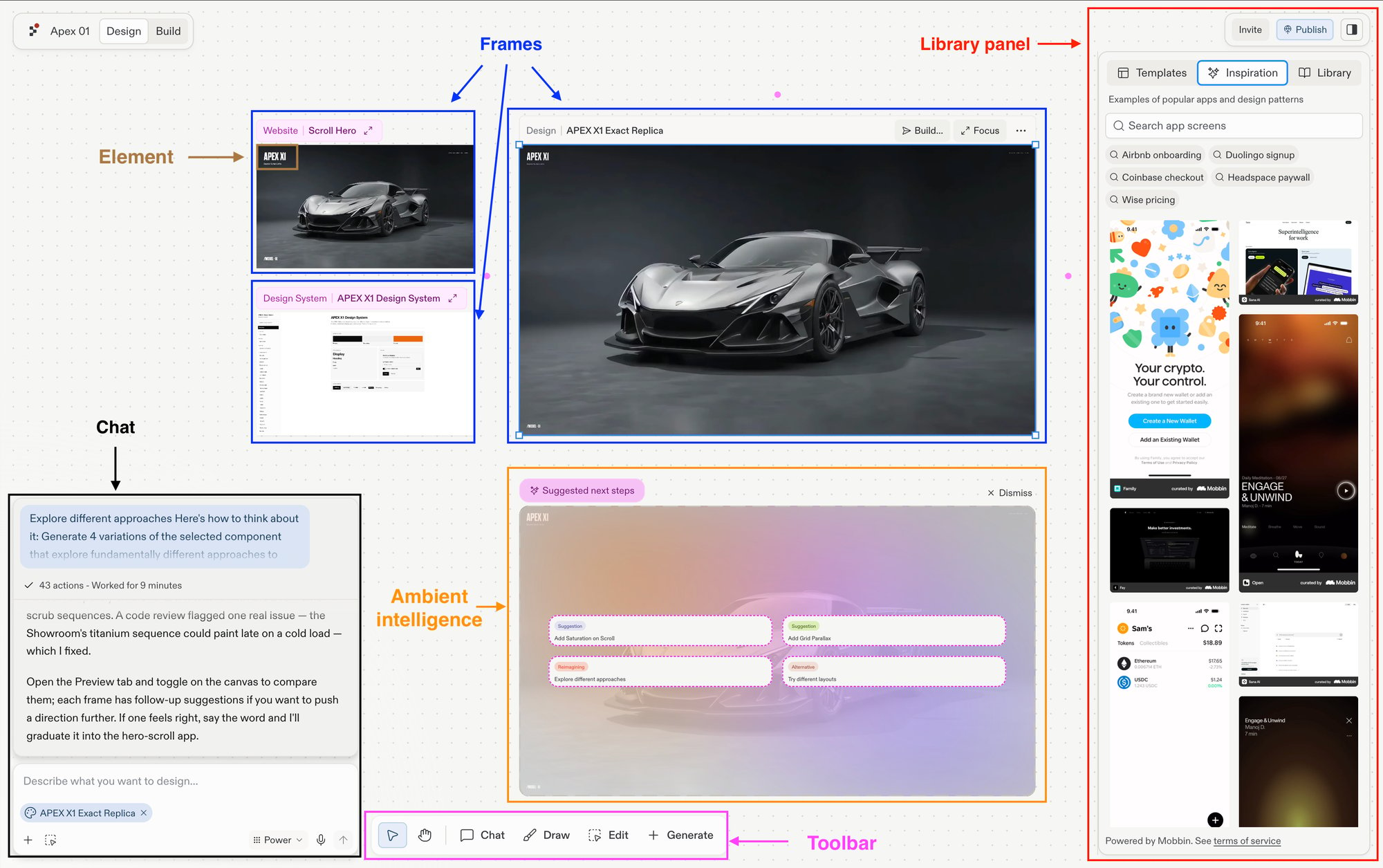 Seven components make up the Replit Design workspace:
* **[Canvas](/design/canvas)**: the design view of the Project Editor, an infinite pan-and-zoom board that holds every frame, shape, and note.
* **[Frames](/design/frames)**: every tile on Canvas. Frames can be live artifacts (websites, slides), design mockups, images, videos, or vector graphics.
* **[Elements](/design/elements)**: the individual pieces inside a frame, such as headings, buttons, images, and form fields.
* **[Chat](/design/chat-about-your-design)**: the Agent chat docked on the canvas. Describe what you want to make, or select a frame and ask for small or larger edits; minimize it for a full canvas.
* **[Ambient intelligence](/design/explore-suggestions)**: suggested next steps that appear beside a selected frame, each one click from generating a new direction. See [Explore suggestions](/design/explore-suggestions) for how it works.
* **[Toolbar](/design/toolbar)**: the floating bar at the bottom of Canvas with the Interact, Pan, Chat, Draw, Edit, and Generate tools.
* **[Library panel](/design/library-panel)**: starter templates, Mobbin-curated inspiration, and your own past creations, ready to drop onto the canvas.
## How they fit together
Each component picks up where the previous one leaves off, from a blank board to a design you can build.
### 1. Put frames on the canvas
Generate frames from a chat prompt or the toolbar's **Generate** menu. A frame can be a design mockup, a web app, a mobile app, slides, an image, a video, or a vector graphic.
### 2. Iterate on a frame
Select any frame to work on it individually. Chat about it in your own words, follow a [suggestion](/design/explore-suggestions) to branch a new direction, or **Focus** it to work up close. When it's right, **Build** it into a live app.
Seven components make up the Replit Design workspace:
* **[Canvas](/design/canvas)**: the design view of the Project Editor, an infinite pan-and-zoom board that holds every frame, shape, and note.
* **[Frames](/design/frames)**: every tile on Canvas. Frames can be live artifacts (websites, slides), design mockups, images, videos, or vector graphics.
* **[Elements](/design/elements)**: the individual pieces inside a frame, such as headings, buttons, images, and form fields.
* **[Chat](/design/chat-about-your-design)**: the Agent chat docked on the canvas. Describe what you want to make, or select a frame and ask for small or larger edits; minimize it for a full canvas.
* **[Ambient intelligence](/design/explore-suggestions)**: suggested next steps that appear beside a selected frame, each one click from generating a new direction. See [Explore suggestions](/design/explore-suggestions) for how it works.
* **[Toolbar](/design/toolbar)**: the floating bar at the bottom of Canvas with the Interact, Pan, Chat, Draw, Edit, and Generate tools.
* **[Library panel](/design/library-panel)**: starter templates, Mobbin-curated inspiration, and your own past creations, ready to drop onto the canvas.
## How they fit together
Each component picks up where the previous one leaves off, from a blank board to a design you can build.
### 1. Put frames on the canvas
Generate frames from a chat prompt or the toolbar's **Generate** menu. A frame can be a design mockup, a web app, a mobile app, slides, an image, a video, or a vector graphic.
### 2. Iterate on a frame
Select any frame to work on it individually. Chat about it in your own words, follow a [suggestion](/design/explore-suggestions) to branch a new direction, or **Focus** it to work up close. When it's right, **Build** it into a live app.
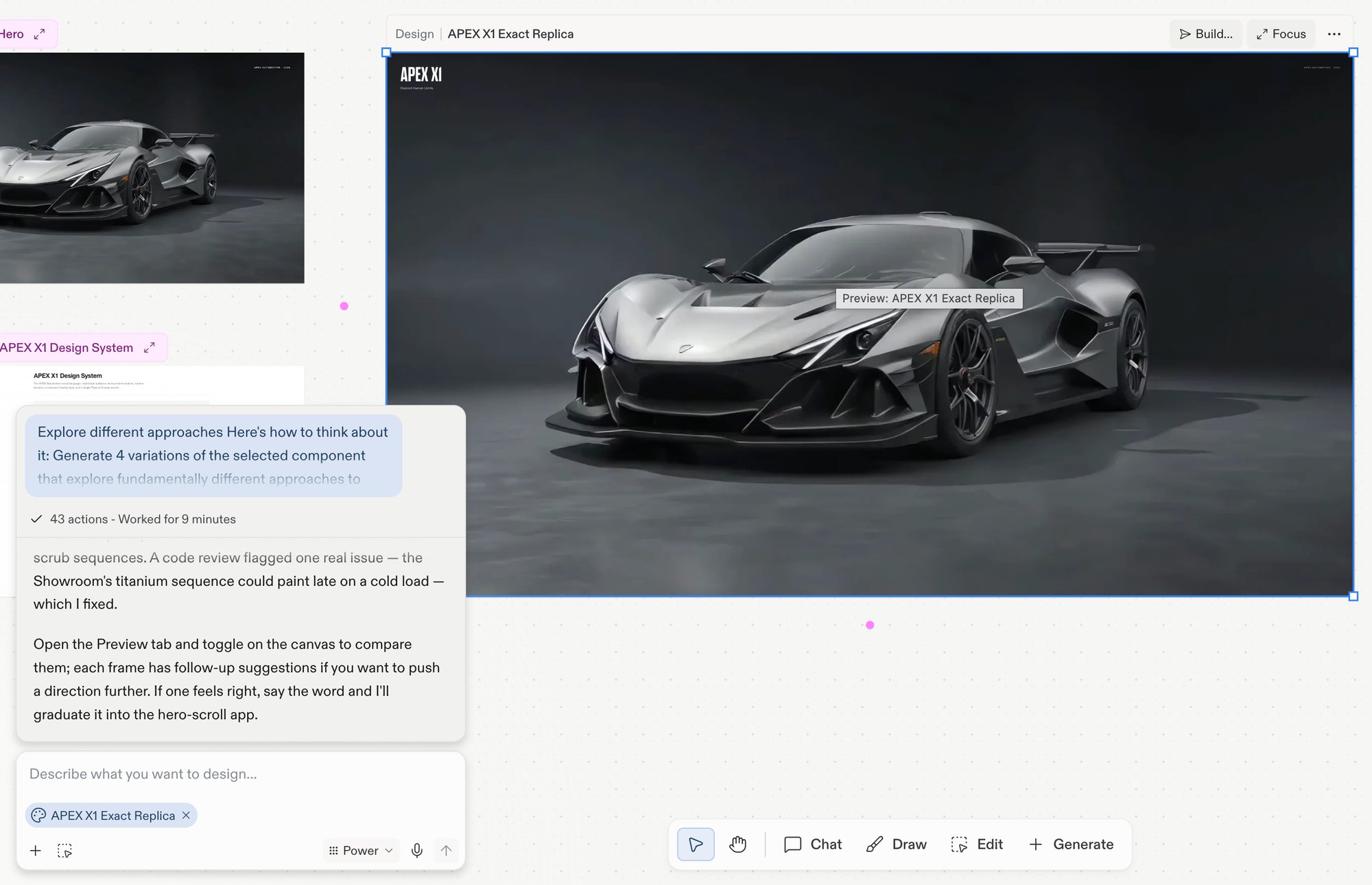 ### 3. Edit, annotate, or generate with the toolbar
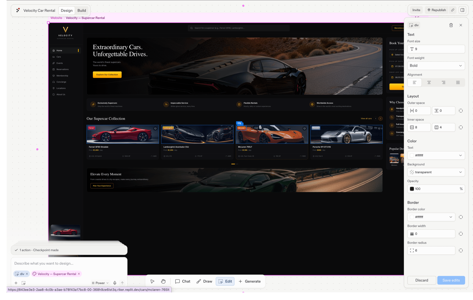
The toolbar covers three jobs: **Edit** selects a single element inside a frame and opens the Visual Editor, **Draw** annotates the board with sketches, arrows, and sticky notes that Agent reads, and **Generate** creates the images, videos, and vector graphics your design needs.
### 3. Edit, annotate, or generate with the toolbar
The toolbar covers three jobs: **Edit** selects a single element inside a frame and opens the Visual Editor, **Draw** annotates the board with sketches, arrows, and sticky notes that Agent reads, and **Generate** creates the images, videos, and vector graphics your design needs.
 ### 4. Pull inspiration from the library panel
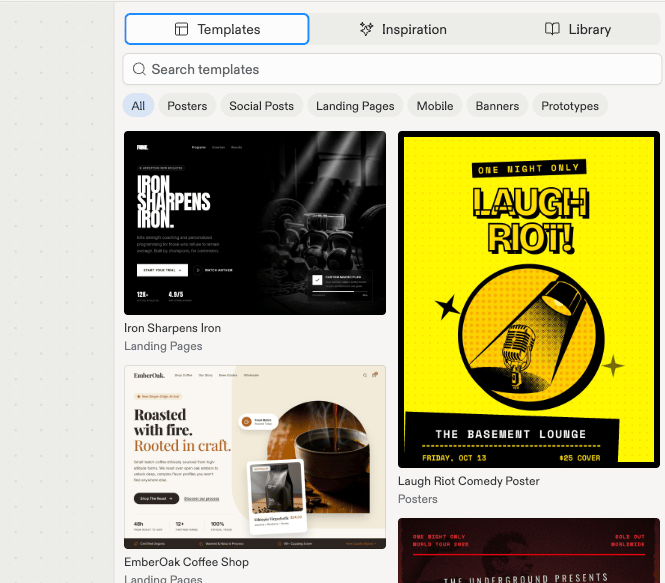
For inspiration and starting points, open the library panel. Templates land on the canvas as live, editable frames; Mobbin-curated inspiration lands as a static reference image to steer your next generation.
### 4. Pull inspiration from the library panel
For inspiration and starting points, open the library panel. Templates land on the canvas as live, editable frames; Mobbin-curated inspiration lands as a static reference image to steer your next generation.
 ## Explore each component
The infinite board where you generate, arrange, and iterate on frames.
Frame kinds, the per-frame action bar, Build, and Focus.
Select and edit the individual pieces inside a frame.
Brief Agent about the board, a frame, or a single element.
One-click suggested next steps beside your selected frame.
The full tool catalog, keyboard shortcuts, and board gestures.
Templates, Mobbin-curated inspiration, and your own creations.
## Next steps
* [Design your first screen](/design/design-your-first-screen): generate your first frames from a prompt.
* [What is Replit Design](/design/what-is-replit-design): the full journey from prompt to on-brand app.
## Explore each component
The infinite board where you generate, arrange, and iterate on frames.
Frame kinds, the per-frame action bar, Build, and Focus.
Select and edit the individual pieces inside a frame.
Brief Agent about the board, a frame, or a single element.
One-click suggested next steps beside your selected frame.
The full tool catalog, keyboard shortcuts, and board gestures.
Templates, Mobbin-curated inspiration, and your own creations.
## Next steps
* [Design your first screen](/design/design-your-first-screen): generate your first frames from a prompt.
* [What is Replit Design](/design/what-is-replit-design): the full journey from prompt to on-brand app.