> ## Documentation Index
> Fetch the complete documentation index at: https://docs.replit.com/llms.txt
> Use this file to discover all available pages before exploring further.

# Get the most out of Free Mode

> Learn how to get more from Free Mode for everyday chat, creation, and building.

export const FreeModePlanAvailability = `Free Mode is available on the Starter, Core, and Pro plans. Your Free Mode limits depend on your plan, and Core and Pro include an allowance that refreshes every ${FreeModeAllowanceRefreshPeriod}.`;

export const FreeModeCover = () => <>
    <style>{`
      .free-mode-cover {
        position: relative;
        display: grid;
        min-height: 360px;
        aspect-ratio: 16 / 10;
        overflow: hidden;
        place-items: center;
        margin: 28px 0 42px;
        border: 0;
        border-radius: 16px;
        padding: clamp(24px, 4vw, 44px);
        isolation: isolate;
        background:
          radial-gradient(circle at 50% -18%, rgba(255,255,255,.82), transparent 42%),
          radial-gradient(circle at 4% 96%, rgba(255,184,146,.48), transparent 38%),
          linear-gradient(140deg, #ff764d, #ff3c00 60%, #c92d00);
        box-sizing: border-box;
      }
      .free-mode-cover-panels {
        position: absolute;
        inset: 0;
        overflow: hidden;
        background:
          linear-gradient(180deg, rgba(255,255,255,.14), rgba(255,255,255,0) 48%, rgba(111,24,0,.2));
      }
      .free-mode-cover-panels span {
        position: absolute;
        display: block;
        border-radius: 999px;
        pointer-events: none;
      }
      .free-mode-cover-panels span:nth-child(1) {
        width: 62%;
        height: 54%;
        left: 19%;
        top: -34%;
        background: rgba(255, 255, 255, .2);
        filter: blur(30px);
      }
      .free-mode-cover-panels span:nth-child(2) {
        width: 48%;
        height: 58%;
        left: -20%;
        bottom: -28%;
        background: rgba(255, 203, 180, .34);
        filter: blur(36px);
      }
      .free-mode-cover-panels span:nth-child(3) {
        width: 44%;
        height: 60%;
        right: -18%;
        top: 20%;
        background: rgba(164, 32, 0, .2);
        filter: blur(44px);
      }
      .free-mode-cover-panels span:nth-child(4) {
        width: min(72%, 520px);
        height: 68%;
        left: 50%;
        top: 16%;
        transform: translateX(-50%) rotate(3deg);
        border: 1px solid rgba(255,255,255,.26);
        border-radius: 28px;
        background: transparent;
      }
      .free-mode-menu {
        position: relative;
        z-index: 1;
        width: min(66%, 660px);
        border: 1px solid rgba(255,255,255,.46);
        border-radius: 20px;
        background: linear-gradient(180deg, rgba(255,255,255,.25), rgba(255,255,255,.1));
        box-shadow: 0 22px 44px rgba(78,20,4,.22), inset 0 1px 0 rgba(255,255,255,.14);
        padding: 20px clamp(24px, 3.5vw, 34px);
        color: #fff;
        backdrop-filter: blur(7px) saturate(110%);
      }
      .free-mode-menu-label {
        margin: 0 0 8px;
        font-size: clamp(13px, 1.5vw, 17px);
        font-weight: 600;
        letter-spacing: .02em;
        text-transform: uppercase;
      }
      .free-mode-row {
        display: grid;
        grid-template-columns: 18px minmax(0, 1fr);
        gap: 18px;
        align-items: start;
        margin: 0;
        padding: 8px 0;
        color: #fff !important;
      }
      .free-mode-row-dot {
        width: 10px;
        height: 10px;
        margin-top: 8px;
        border: 2px solid currentColor;
        border-radius: 999px;
        box-sizing: border-box;
      }
      .free-mode-row strong {
        display: block;
        font-size: clamp(21px, 2.2vw, 27px);
        font-weight: 500;
        letter-spacing: -.025em;
        line-height: 1.1;
        color: inherit !important;
      }
      .free-mode-row p {
        margin: 4px 0 0;
        font-size: clamp(13px, 1.45vw, 16px);
        line-height: 1.4;
        color: inherit !important;
      }
      .free-mode-row.is-selected {
        width: calc(100% + 96px);
        margin: 0 0 0 -48px;
        border-radius: 18px;
        background: #fff1ed;
        padding: 13px 28px;
        color: #746c69 !important;
        box-shadow: 0 18px 34px rgba(116,39,18,.13);
        box-sizing: border-box;
      }
      .free-mode-row.is-selected .free-mode-row-dot {
        border-color: #746c69;
        background: #746c69;
      }
      @media (max-width: 640px) {
        .free-mode-cover { min-height: 390px; aspect-ratio: auto; padding: 24px 18px; }
        .free-mode-menu { width: 92%; padding: 28px 22px; }
        .free-mode-row { gap: 12px; padding: 15px 0; }
        .free-mode-row.is-selected { width: calc(100% + 24px); margin-left: -12px; padding: 18px 16px; }
      }
    `}</style>
    <div className="free-mode-cover" role="img" aria-label="Agent Modes menu with Free Mode selected above Power Mode and Max Mode">
      <div className="free-mode-cover-panels" aria-hidden="true">
        <span />
        <span />
        <span />
        <span />
      </div>
      <div className="free-mode-menu" aria-hidden="true">
        <div className="free-mode-menu-label">Agent Modes</div>
        <div className="free-mode-row is-selected">
          <span className="free-mode-row-dot" />
          <div>
            <strong>Free</strong>
            <p>Great for everyday tasks and quick edits.</p>
          </div>
        </div>
        <div className="free-mode-row">
          <span className="free-mode-row-dot" />
          <div>
            <strong>Power</strong>
            <p>A smart balance of speed and capability for most work.</p>
          </div>
        </div>
        <div className="free-mode-row">
          <span className="free-mode-row-dot" />
          <div>
            <strong>Max</strong>
            <p>The most capable models for complex, ambitious builds.</p>
          </div>
        </div>
      </div>
    </div>
  </>;

export const PromptingCardVisual = () => <div className="chat-use-case-visual" aria-hidden="true" style={{
  background: "radial-gradient(circle at 48% -30%, rgba(255,255,255,.78), transparent 54%), linear-gradient(140deg, #ff764d, #ff3c00 60%, #c92d00)"
}}>
    <div style={{
  position: "relative",
  width: "72%",
  margin: "auto",
  padding: 12,
  border: "1px solid rgba(255,255,255,.56)",
  borderRadius: 14,
  background: "rgba(255,255,255,.2)"
}}>
      <span style={{
  display: "block",
  width: "66%",
  height: 7,
  borderRadius: 999,
  background: "rgba(255,255,255,.8)"
}} />
      <span style={{
  display: "block",
  width: "92%",
  height: 7,
  marginTop: 7,
  borderRadius: 999,
  background: "rgba(255,255,255,.38)"
}} />
      <span style={{
  display: "block",
  width: "82%",
  height: 22,
  marginTop: 12,
  border: "1px solid rgba(255,255,255,.62)",
  borderRadius: 8,
  background: "rgba(255,255,255,.16)"
}} />
    </div>
  </div>;

<FreeModeCover />

<p>
  {FreeModePlanAvailability}
</p>

Free Mode lets you chat, create, and build without using Power Mode or Max Mode credits.

<Note>
  Free Mode always uses intelligent model routing, so Replit selects the model
  for your request. You cannot select a specific model in Free Mode.
</Note>

Routines do not run in Free Mode. They run in Power or Max Mode and require a per-run budget. Learn more about [Routines](/chat/routines).

## Get more from your allowance

Free Mode is a good place to keep momentum on the work in front of you. Use it to:

* Explore and validate an idea before committing to a bigger build.
* Start a new project, make a first pass at a feature, or work through a smaller change.
* Ask questions, create a plan, and refine your work through follow-up messages.
* Continue everyday work without using credits while your allowance is available.

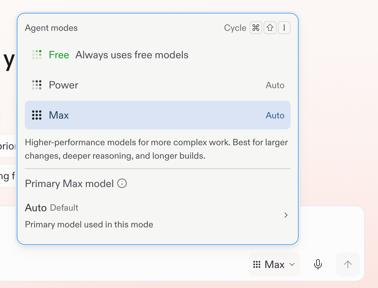
To start, open the mode selector below the prompt box and make sure the mode is set to **Free**. Then give Replit a focused request: state the outcome you want, share the context that matters, and use follow-up questions to refine the result.

## Know when to use another mode

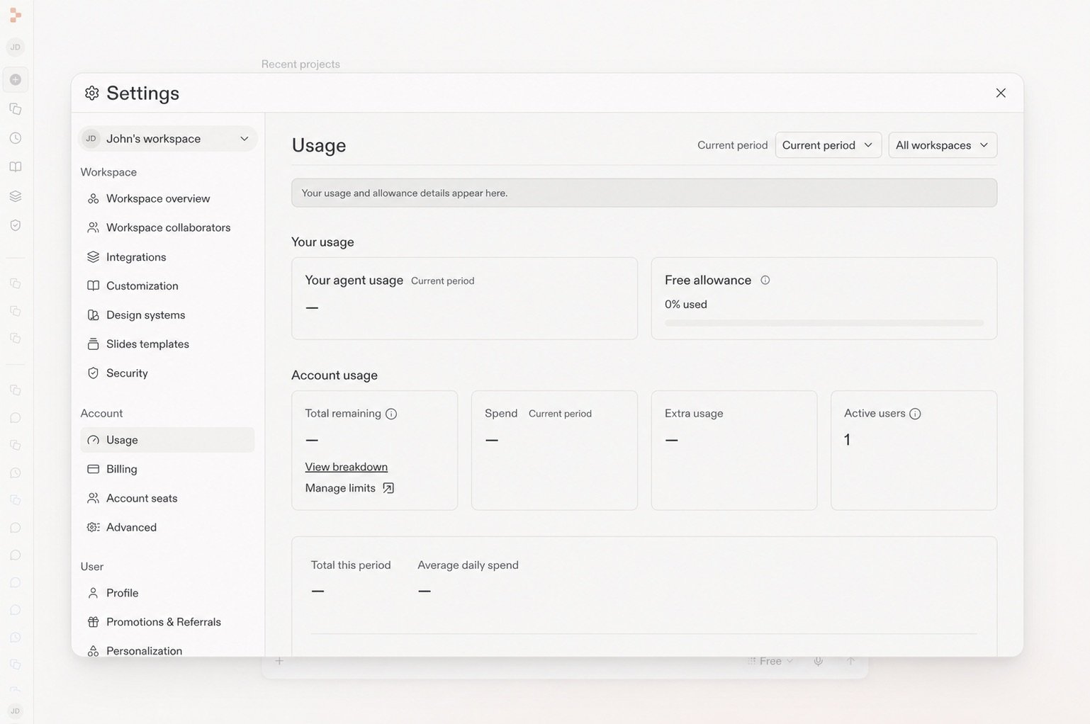
Free Mode limits depend on your plan. Open **Settings** → **Usage** to check your current limit and reset timing.

<Frame caption="Your Usage page shows the remaining Free allowance and when it refreshes.">
  <img src="https://mintcdn.com/replit/teDUL4A-lNO7dv1O/images/chat/free-mode-usage-sanitized.jpg?fit=max&auto=format&n=teDUL4A-lNO7dv1O&q=85&s=d0538032632b4201a99f555f47999333" alt="Settings Usage page with the Free allowance panel visible" width="1538" height="1022" data-path="images/chat/free-mode-usage-sanitized.jpg" />
</Frame>

On Core and Pro plans, switch to **Power Mode** or **Max Mode** when you need more capability, want to choose a specific model, or reach your Free Mode allowance. Those modes use monthly credits. Builders on Starter need to upgrade before using Power Mode or Max Mode.

<Tip>
  If your plan includes Power Mode and Max Mode, use Free Mode for the first
  step and switch only when the task calls for more capability. Replit lets you
  know before a request shifts to a mode that incurs usage costs.
</Tip>

## Choose the mode that fits the work

| If you want to...                                          | Start with... |
| ---------------------------------------------------------- | ------------- |
| Explore, ask questions, plan, or begin building            | Free Mode     |
| Get a strong balance of speed and capability for most work | Power Mode    |
| Tackle complex or ambitious work                           | Max Mode      |

Power Mode replaces Economy Mode at the same cost, with the same or better performance. On Core and Pro plans, you can select an available model in Power Mode or Max Mode.

## Learn more

<section className="chat-mkt chat-workflow-grid has-visuals">
  <a className="chat-example has-visual" href="/features/agent/agent-modes#free-mode">
    <div className="chat-use-case-visual palette-ink">
      <div className="chat-use-case-window">
        <i />

        <i />

        <i />

        <b />

        <b />

        <b />
      </div>

      <em>
        <Icon icon="bolt" size={24} />
      </em>
    </div>

    <span>
      <Icon icon="bolt" size={19} />
    </span>

    <div className="chat-card-title">Free Mode reference</div>
    <p>Review how Free Mode fits with Power Mode and Max Mode.</p>
    <div className="chat-card-link">Open the reference →</div>
  </a>

  <a className="chat-example has-visual" href="/chat/prompting">
    <PromptingCardVisual />

    <span>
      <Icon icon="comment-dots" size={19} />
    </span>

    <div className="chat-card-title">Prompting</div>
    <p>Learn how to give Replit useful direction and context.</p>
    <div className="chat-card-link">Continue →</div>
  </a>
</section>

Next, learn how [intelligent model routing](/chat/auto-mode) selects a model as the task changes.